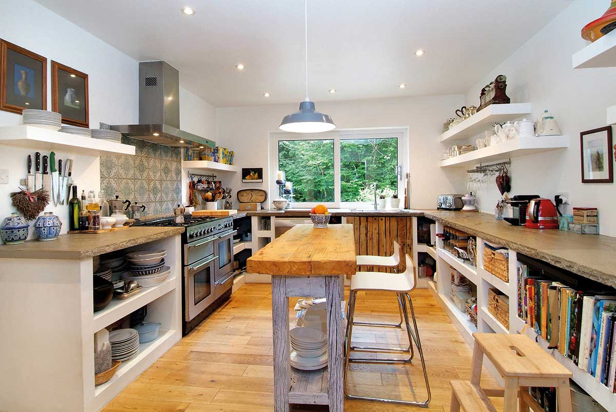
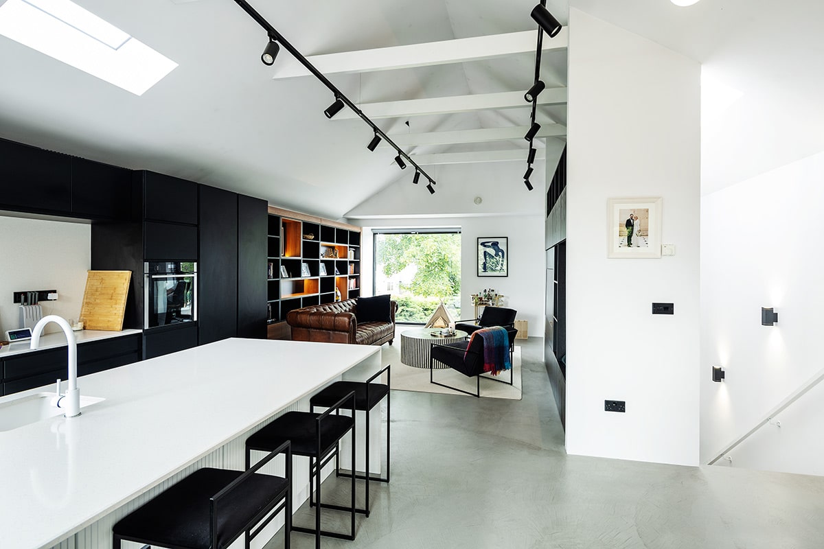
Roughly every five years your needs as a family will change. As the children grow up and, eventually move out of the house, you’ll see a shift in how living areas are used and what is needed from them. I think open is the way to go for family life – it just works, especially if both parents are in full time employment. Evenings are short and precious, you will want to spend time together. It’s not ideal to have the children in one room while you’re cooking in another.
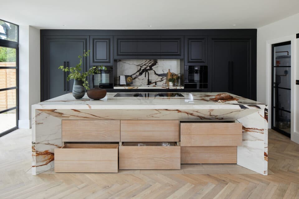
The design and size of the space will of course be dependent on budget and layout but I do think the bigger the space the better. For family life it’s preferable to have an area dedicated to dining and use the island as a breakfast bar. The most compact set up would be doing away with the dining area and using the island for mealtimes. Remember though that the rule of thumb for circulation space, is to provide between 1200mm to1800mm between opposing work surfaces, so make sure your plans allow for this and the island. 1300mm between opposite work areas is perfect, it allows enough room to manoeuvre without being so great that unnecessary steps are taken.
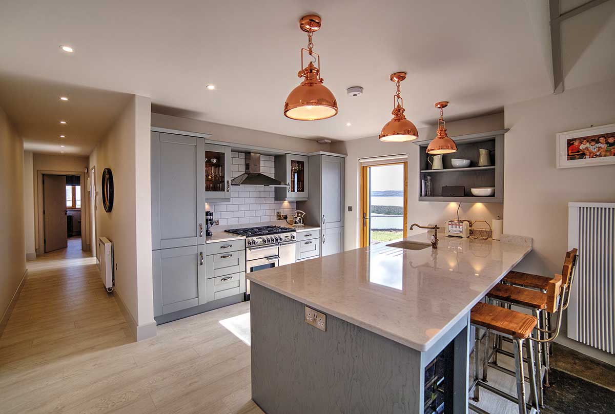
‘For family life it’s preferable to have an area dedicated to dining and use the island as a breakfast bar.’
In terms of creating ‘zones’ I’m not an advocate of lowering ceiling heights in the living area. I think more is more in this case, so don’t settle for less than 2.5m in ceiling height but if you can go more in the kitchen area, do. Of course then there’s the important matter of taste and style and whether you want to consider introducing Universal Design principles, which aim to cater to people of all mental and physical conditions.
For instance, Universal Design factors in the fact that many people can find blank elevations to cupboards confusing. The methodology therefore suggests a mix of open shelving and glass fronted units to act as a reminder of what’s inside and to allow easy checking of contents. I personally prefer the clean contemporary look that sleek, uncluttered lines afford (see top tips on opposite page).
Kitchen Milestones
Here are my suggestions to design your kitchen so that it caters to your growing family’s needs:
Ages 2+: With toddlers and young children, the true open plan lifestyle is ideal. You can potter about while keeping an eye on what the kids are up to. Children this age will explore so give them access to some parts of the kitchen to help satiate this need, e.g. with easy to reach, hazard-free presses. Also be conscious of discouraging the use of items that pop in and out, e.g. concealed sockets, as they may quickly become a favourite toy!
Ages 7+: As your children gain independence, their need to be in your company diminishes. To cater to this, segregate the open plan area with French or sliding doors. This will help break things up to achieve privacy in the living area, on demand.
In fact, in a typical semi-detached house from the 1960s or 1970s, knocking the front room through to the kitchen with a set of doors is the most straightforward way to create an open plan. With demolition work, the addition of French doors can set you back around €2-3,000 or £1,500-£2,500 while sliding doors, due to the mechanism and need for second partition, will cost double that.
Ages 18+: It’s no harm thinking about the children fleeing the coop, how will the space work for you as a couple? That set of doors could come in very handy and the island, which is likely to double up as your dining table. Will some of the children continue living at home? That spare sitting room will be a godsend if they do.
The Kitchen Triangle
It’s impossible to talk about kitchen design without talking about the ‘triangle’ which refers to the path between your cooker, fridge and sink. The route to each should form a triangle for ease of use so the idea is not to align your cooker and sink on the same worktop, for example. But as with most design rules, it can be broken. For some cooks it will make sense to have the hob and sink on the same surface. Furthermore according to Universal Design principles this alternative provides a way of reducing the need to carry hot food or liquids from one worktop to another. An ‘L’ or ‘U’-shaped layout, where pans and containers can slide from hob to sink, is another option.
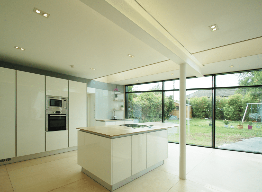
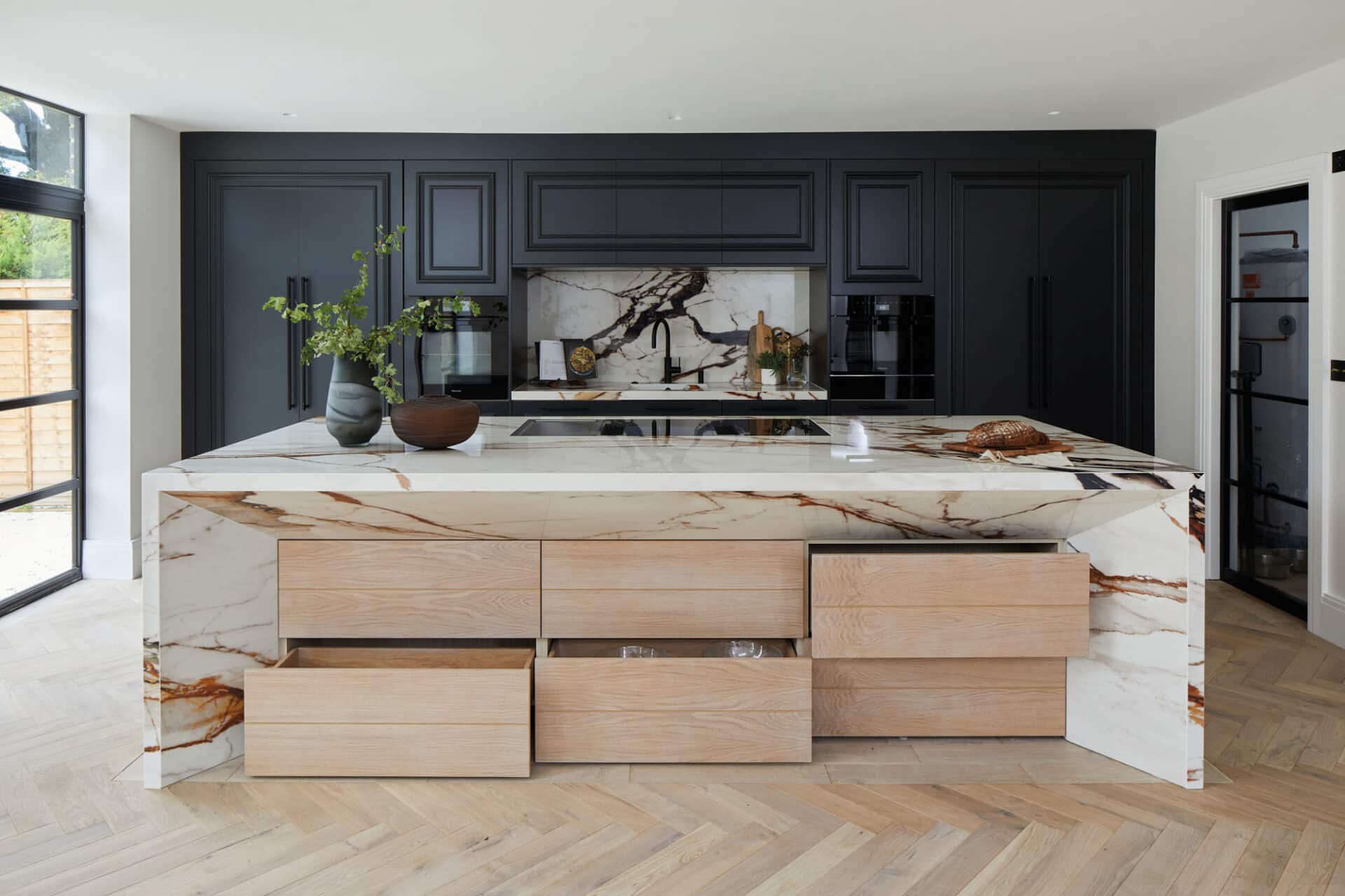
In terms of placement ideas, I would suggest putting the hob on the island to face the living area, it’s much more sociable and interactive. Placing the cooker on the wall means you’ll have your back to the action.
Other basic tips include not crowding the sink in a corner, it should be 460mm away from any return in the work surface. Also think of where you will need to put things down – allow 300mm on either side of the hob and to one side of the oven and fridge/freezer (with fixed worktop space or a pull-out shelf). To abide to Universal Design principles and future proof your house so that it can be used by people of all abilities, you should aim to make your worktops 900mm high. Ideally have some sections of worktop height adjustable or use a combination of fixed height worktops between 760mm and 900mm high.
Storage
Storage is the key to a successful design – make greater allowances than you think necessary. Tidying up won’t take as long if everything has its place, and you won’t have to do it as often. A revelation in our house has been the chargeable vacuum cleaner. It’s so easy to use and light, we now vacuum in the kitchen on a daily basis. The first requirement in terms of storage space is to allow for a utility room.
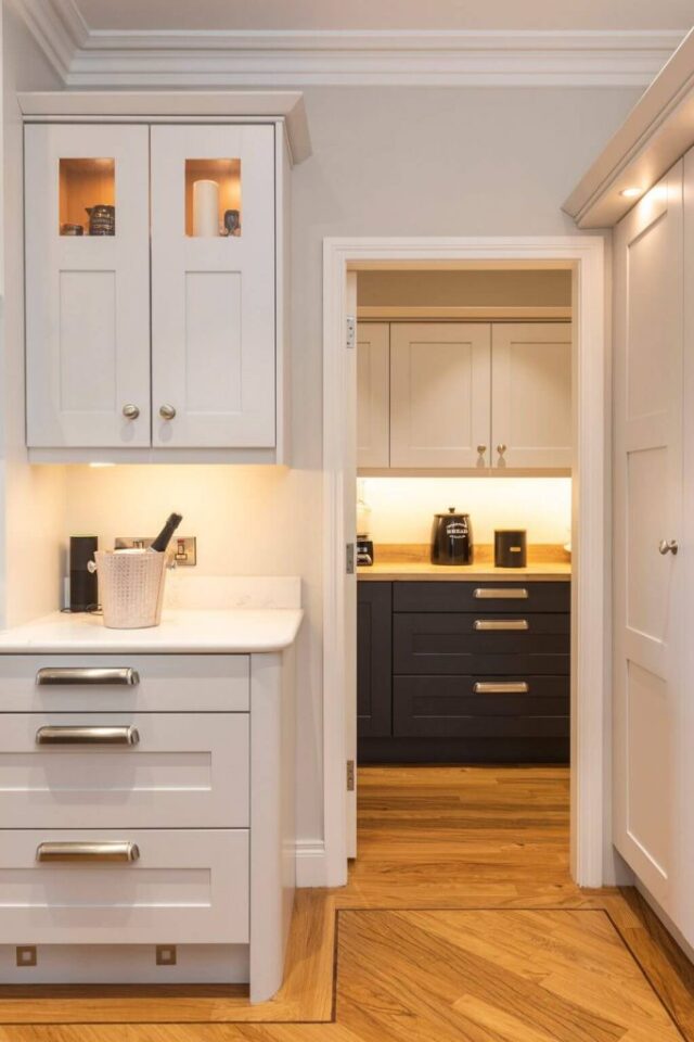
To reduce noise it’s imperative that you move the washing machine and dryer out of the open plan area. I don’t find that dishwashers nowadays are that noisy, and they don’t really impact on tv viewing anymore. For some chefs a pantry is also a musthave, with all items on view in a walk-in area, but for others kitchen cabinets provide sufficient food storage.
For universal access, wall units shouldn’t be placed higher than 450mm above worktop level. Consider too that pull-out drawers are easier to use than, say, deep shelves under your worktops. Even though some people introduce small radiators in the kitchen to warm their tea towels I don’t like to see mine so I make use of the waste heat from the hot water tap to dry them out. My drawer is right above the tank and airs them out.
Lighting
On self-builds, hiring a lighting designer is not the norm but it’s worth considering if you have the budget. Lighting may seem easy but it’s actually quite tricky to get right.
What I’ve done in the past is use integrated lighting, on the splashback. My kitchen has birch ply shelving with a groove that houses an LED strip, to provide task lighting at the sink. If you have deep drawers consider adding LED strips inside them too. In my open plan I have six pairs of directional LED downlights, which brighten up the island and cover all angles.
Directional lights are flexible in that they can be orientated to hit the spot where you want the most intensity, after the kitchen has been installed. I’ve also introduced dimmer switches for mood lighting as this becomes important when the family winds down and prepares for bedtime.
FURTHER INFORMATION
A Universal Design Guidelines for Homes in Ireland by the Centre for Excellence in Universal Design universaldesign.ie

