As well as providing full interior design services, Lana also offers colour/design consultations, working closely with clients to create their dream space, as was the case for this particular project.
“When you get to know the client you get a feel for what they would like,” she says. “My client told me about her preferred style and I then suggested furniture designs and other elements for the room.
“This consultation was more about cosmetic finishes rather than structural work, focussing on things such as soft furnishings, art and mirrors. Sometimes people struggle most when it comes to finishing a room, as it can be difficult to connect everything together.”
Statement sofas
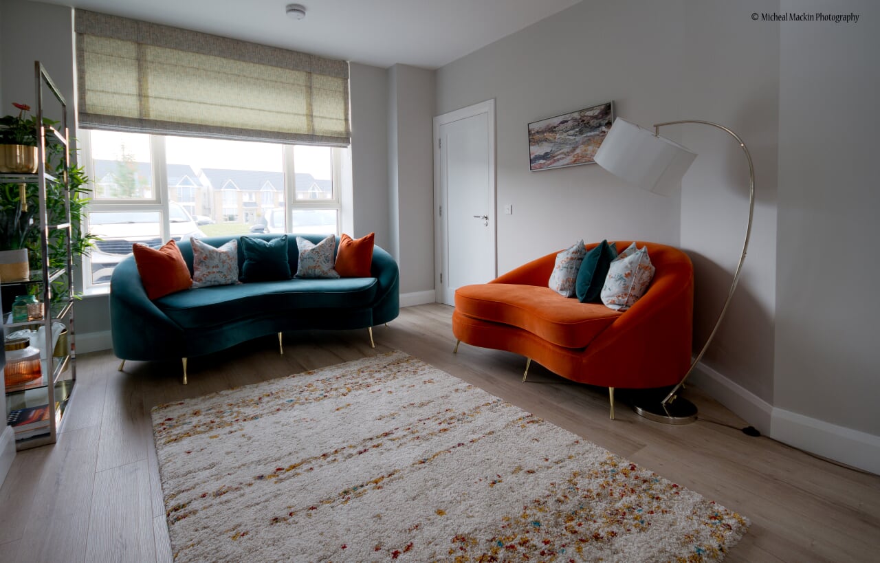
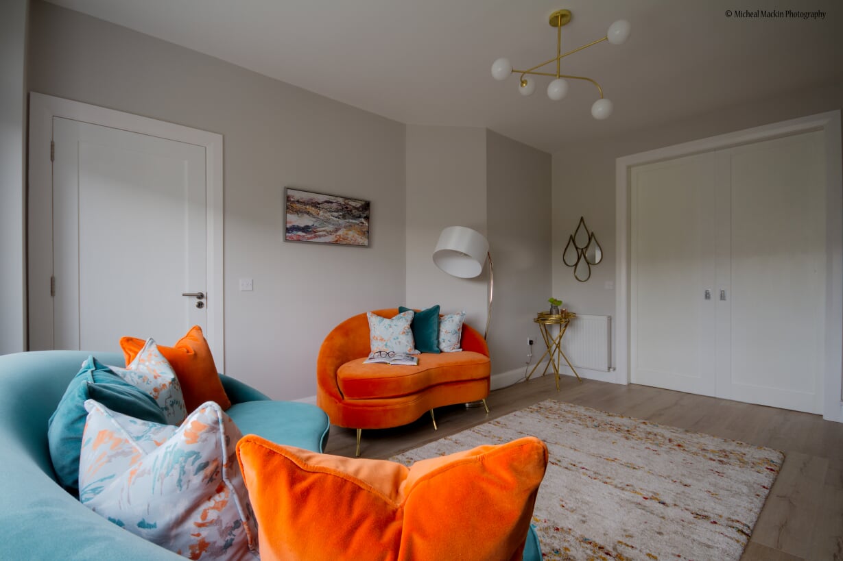
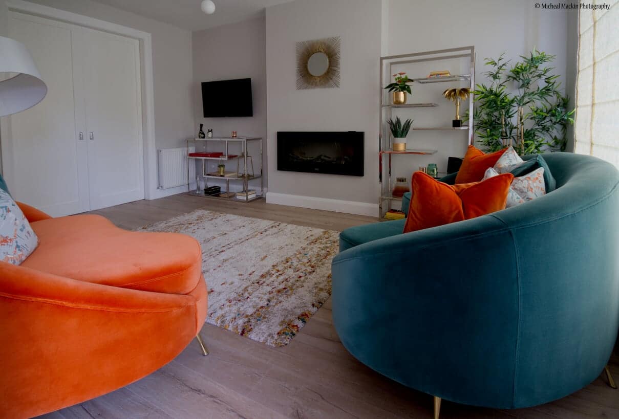
The stand-out feature in this sitting room is undoubtedly the furniture, with a pair of custom-made sofas specially designed to suit the space immediately drawing the eye. Embodying that luxury look each is upholstered in soft velvet, one in a bold orange shade and the other in a calmer teal, their colours complemented by bespoke cushions in similar hues.
“The sofas are the focal point so I wanted to highlight them, that’s why I chose two vibrant colours, to contrast against the neutral walls,” says Lana. “I wanted to balance the bolder orange tones with something more peaceful, however, so teal was ideal as it’s a very relaxing and peaceful colour.”
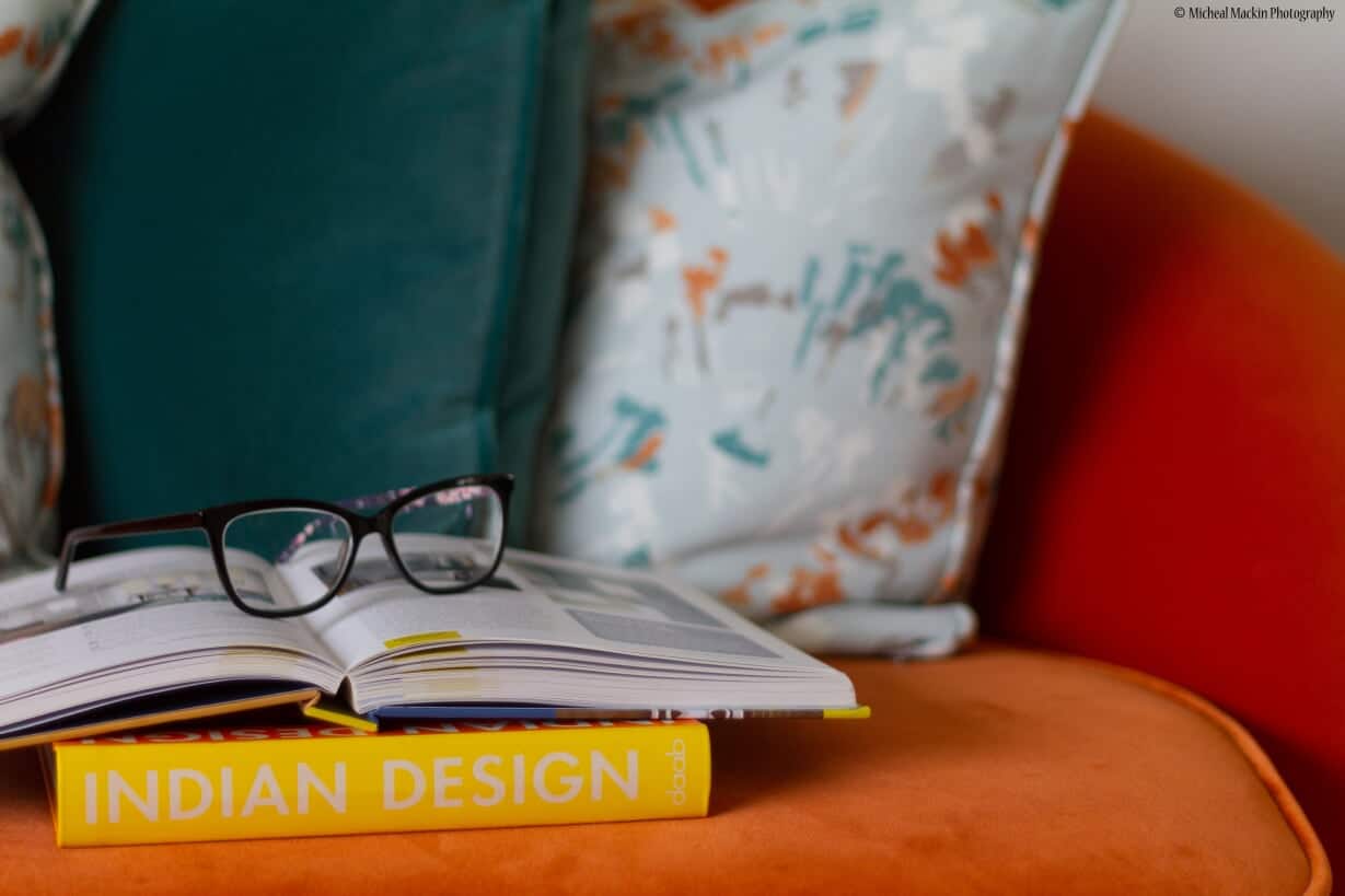
While both sofas have a similar style, the design for each differs slightly, with the right side of the orange settee open-ended – perfect for reclining with a book. Indeed, a floor lamp is strategically positioned above the opposite end of the sofa for just this reason. However, the lack of armrest on this side of the sofa also serves to facilitate traffic flow, giving it a more practical purpose, as one of the room’s two entrances is located beside it.
“The teal sofa is in a similar style to the orange but has arms on both sides as there’s the space for that,” says Lana. “So the style of the two is connected but isn’t exactly the same.”
The velvet texture of both sofas adds comfort as well as warmth to the room and works well against the pale grey walls and neutral décor elsewhere. It’s also the perfect material, says Lana, for using in a room which perhaps isn’t quite as busy as other spaces within the home, so there’s less wear and tear on that delicate, luxury fabric. Further warmth and a touch of subtle opulence comes from the brass legs of each sofa which again, works perfectly in terms of the project brief.
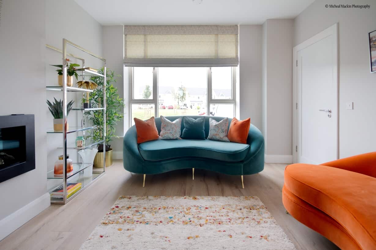
“The overall concept was simple elegance and I wanted to bring in that luxury look, as well as introducing a bit of art deco-inspired furniture with the curvy sofa designs,” says Lana. “Art deco is quite trendy again at the minute but it’s also a timeless style that lasts.”
Soft furnishings
With a large window at one end of the room the space here is accentuated by a bespoke Roman blind rather than curtains, making it appear more open, as well as being practical. Attached to the ceiling the blind adds drama to the sitting room with its unique style and brings in further layers of texture and colour.
“The fabric from the sofa is connected with that of the blind and the cushions,” says Lana. “The blind also has a mixture of teal and orange tones throughout it and is custom-made to suit the window.”
Also custom-made, the cushions are a combination of velvet and cotton fabrics – again, creating layers of textures in the room and mixing luxury materials with simpler fabrics. They also subtly weave in some additional colours and complement the abstract art hanging behind the orange sofa, which has more of those calming, peaceful tones.
“I connected all the colours, with fresh tones also brought in through the artwork,” says Lana. “That, in turn, flows into the colours of the rug. The different patterns and similar colours add extra interest to the room without being overpowering. With vibrant colours I always use them in little amounts for this reason.”
Stylishly decorative lighting
Moving past the orange sofa – the perfect reading spot – a large floor lamp mirrors the curved lines of the seating as it curls up over the furniture.
“Sleek, elegant, luxury and simpleis how I would describe the style of this room and the lamp here represents exactly this,” says Lana.
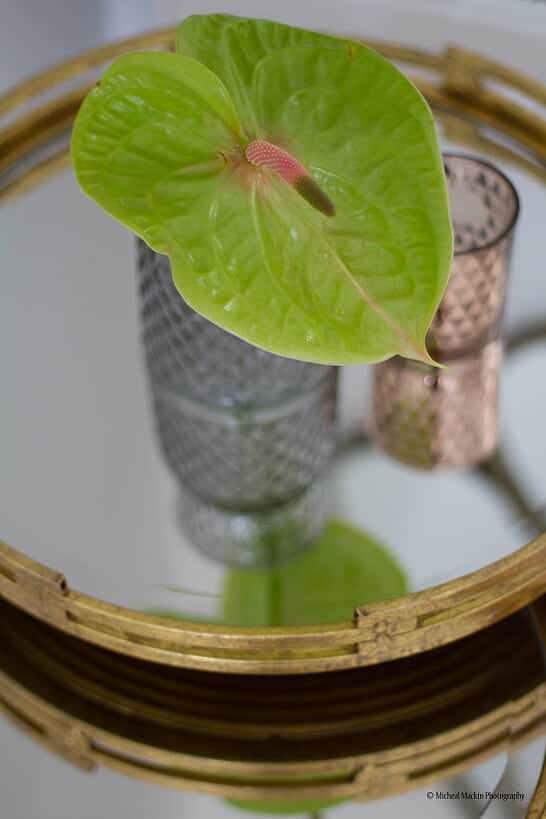
The simple white shade has a silk-like texture and is adjustable for added convenience, with a hint of art deco style. Meanwhile, in the adjacent corner sits a pair of elegant brass side tables from Mindy Brownes Interiors. These are also adjustable so can easily be folded away, or moved around the room according to need.
“They’re very practical,” says Lana. “I don’t like to use coffee tables because they take up a lot of space. With side tables you can put them in the corner out of the way. Also, this room has two doors – a set of double doors and a single door – so you couldn’t really block the way with furniture. I wanted to keep the space open.”
Above the tables, brass features continue with metal mirror art in multiple teardrop shapes which again, add decorative elegance to the space as well as having a more practical purpose. Indeed, positioned opposite the large window, the mirror reflects light into the room, creating a more open, airy space. It also connects the furniture shapes, mirroring the curvy look of the sofas.
“When you work with straight lines you can create something nice and simple, but not as relaxed as with a curve,” says Lana. “Curves are more relaxing; lines are more formal. I like to bring hidden details into my designs.”
The main light in the room is another elegant and eye-catching piece which once again carries a luxury art deco vibe, though in a simpler, more modern style. The fixture itself has a brushed brass finish, while the five glass globe lights are rendered in a simple white gloss.
“My client really loved its curvy style and we chose to make the light a bit of a feature piece,” says Lana.
Invisible shelving
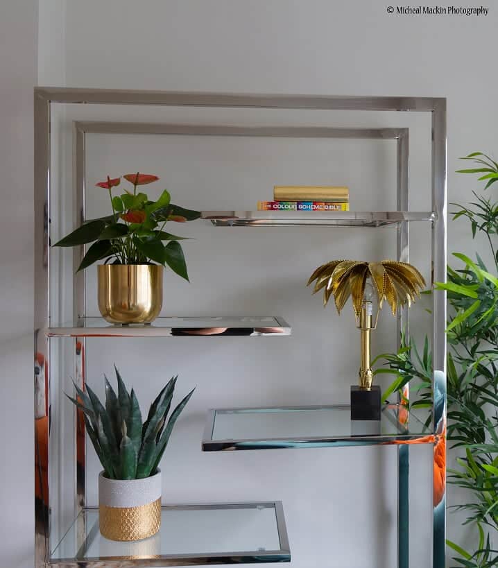
Storage is something most rooms need in some shape or form and, with a variety of ornaments and books, Lana’s client wanted somewhere to keep them without having anything built-in, to retain that spacious feel. The solution was open, glass shelving with polished chrome frames, which makes the accessories look as if they’re floating in mid-air.
“We mixed the metals as we didn’t want too much brass,” says Lana. “It also makes it more homely. I always think that if all the metals are the same in a room it makes it more like a hotel.
“I wanted to make the shelves ‘disappear’ so I chose metal that connected with the grey walls and glass, so they weren’t too obvious. It’s therefore the ornaments that you see first.”
Additional accessories
For those final finishing touches, Lana recommended adding some plants, which lift the room by virtue of their presence as living things and add subtle drama to the space. Meanwhile, a brass tropic lamp shaped like a palm tree on the shelves complements this natural look while also creating mood lighting in the evenings.
“The client really liked the lamp,” says Lana. “It’s both ornamental and a light. I source a lot of my products from Irish suppliers as I like to support the Irish market but sometimes I also buy things in from abroad, so items are more unique.”
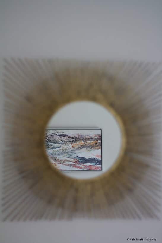
The simple, elegant style seen throughout the room continues in a brushed brass mirror above an existing electric fire, which has a vintage vibe and again, adds warmth to the room with its golden tones.
“The client was very open-minded and she loved everything afterwards,” says Lana. “It’s all her style and my ideas. It was great working with her because she was so open to everything and the end result is just what she wanted.”
