In this article we cover:
- Basic design principles from universal design to requirements arising out of building regulations
- Choosing the right room size
- Window placement
- How to zone the space
- The kitchen triangle: what it is, pros and cons
Kitchen design principles for easy access
Universal Design principles were devised to future proof your house so that it can be used by people of all abilities. The guidelines provide helpful kitchen tips/advice and dimensions to take into account; they are free to access on universaldesign.ie
Even though parts of the building regulations take into account mobility needs for all ages and walks of life, mostly in the form of access, Universal Design principles are more thorough and provide practical, everyday living, design guidance.
Speaking of the building regulations, they will limit some of your choices. For instance, staircases need to be a certain distance from the kitchen for escape routes and heat emitting appliances must conform to standards, not forgetting the need for a heat detector (as burnt toast will set off a smoke detector).
There are also what can be loosely referred to as eco design principles, or a Less is More approach. Reducing the size of your kitchen comes first, meaning not being pushed into buying gadgets or appliances you don’t need, and keeping the kitchen dimensions fairly compact.
Choosing materials that are sustainably sourced and that emit low levels of volatile organic compounds (VOCs) can at times be easier said than done. But it is worth persevering to find out the credentials of the kitchen components you are buying.
Waste management is another part of the eco movement, and by extension, choosing to buy regional foods without packaging.
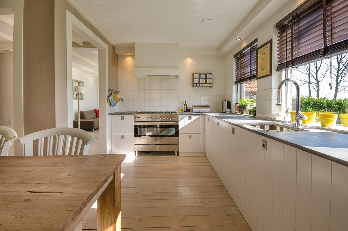
Room size
The design and size of your kitchen will be determined at the earliest design stage. For some, the bigger the space you give the kitchen the better. That’s if it will be your main living space, between cooking meals, doing homework and browsing the internet.
As with all aspects of design, consider how much time you will actually spend in the room and how you will use it.
Consider that most people spend approximately 30 minutes in the morning and an hour in the evening preparing food, then sit for an hour, then relax for three hours at the dining table and sitting area.
So a light filled living and/or dining area with the kitchen in a darker spot, using task lighting from above and beneath presses, is a very viable option.
Ceiling height is important to maintain at 2.5m at least, and if you can go more in the kitchen area, do. The devil will be in the detail to make sure everything fits, without any element looking like it was shoehorned in. This will require making choices about where everything will go early on.
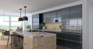
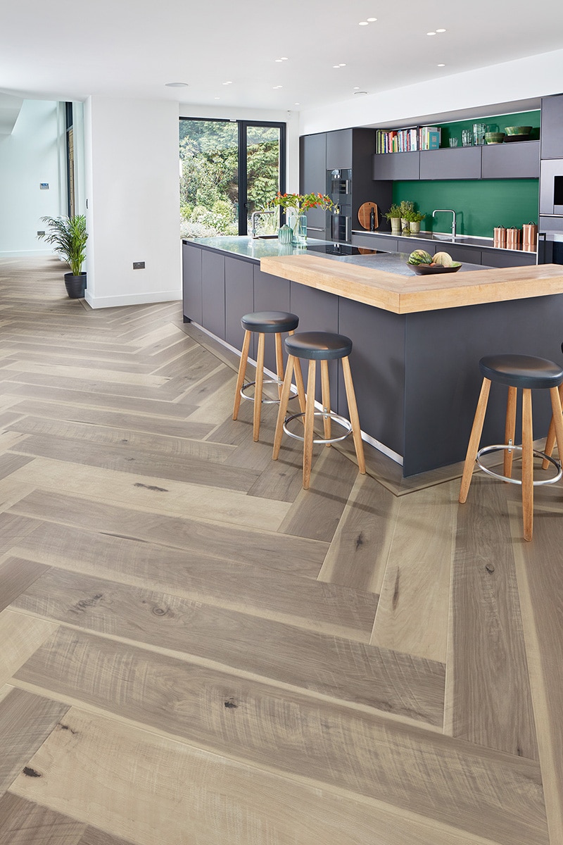
If you dream of an island, the rule of thumb is that you need a room that’s at least 4m by 4m. In an L or U shape kitchen you will need a 1m to 1.2m gap between island and worktop.
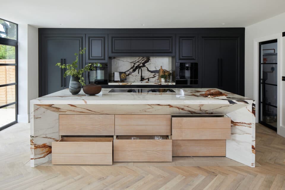
In an open plan configuration, the island will delineate the kitchen…so you may want to make your island stand out with a different or bolder colour/finish…
Window placement
Traditionally, before the advent of dishwashers, the sink was placed under a window looking out onto the garden or back yard. The practical reason for that was light and being able to watch the children at the same time as tidying up.
The area next to a window is arguably a prized spot, too precious to be wasted on a sink and, with modern plumbing and lighting you don’t have to keep to the old way. Sinks are now sited on islands or hidden away depending on the cook’s needs.
Window seats are also becoming increasingly popular in open plan configurations, especially in corners but these can be nestled elsewhere in a well crafted design.
Kitchen triangle
The famous kitchen triangle refers to the path between your cooker, fridge and sink. The route to each should form a triangle for ease of use.
You will need the three to be close to each other, especially in larger kitchens. Keeping food prep (around the sink and hob) and cleaning areas (around the sink and dishwasher) separate is crucial, however.
To be a practical design, the layout should place each of these on one side of the triangle whose total length should not exceed 7.9m and be of no less than 4.3m. This is to allow the best flow in the main kitchen area; any deviation around awkward corners should not exceed 300mm.
If you do a lot of cooking, consider an additional food prep sink – a small inset bowl close to the cooking area. An additional sink in a utility room is a must, for messier jobs such as handwashing clothes and watering plants.
A single crockery storage unit right beside your dishwasher (to one side of the sink and away from the cooking area) will allow you to stand at one point and empty the dishwasher, while another person uses the kitchen to cook or clean.
The dishwasher next to the sink enables you to rinse plates and load the dishwasher all in one movement. So does locating the pull out bin near both of these.
But in reality, not all rooms are shaped to accommodate the working triangle. And so as with most design rules, it can be broken.
For some cooks it will make sense to have the hob and sink on the same surface. In fact, according to Universal Design principles this alternative provides a way of reducing the need to carry hot food or liquids from one worktop to another.
An L or U-shaped layout, where pans and containers can slide from hob to sink, is another option.
Zoning
The kitchen configuration will form part of the initial design stage discussions with your architectural designer, and will take into account how you will circulate in this area and how it connects with the rest of the house.
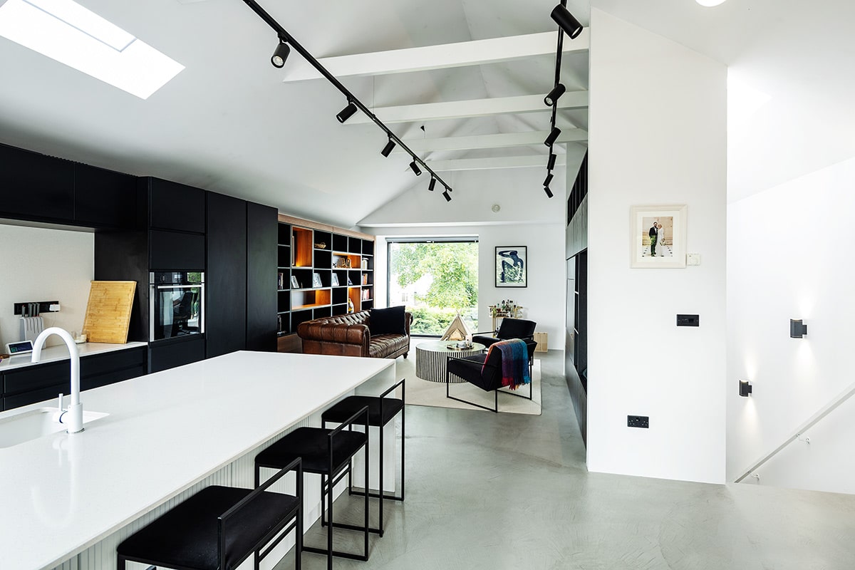
Most common is the open plan, which refers to integrating living/kitchen/dining areas in one space. Semi open plan or broken plan refers to the same idea but with some element of zoning or partition.
Post pandemic, most of us will have intimately experienced what works (and what doesn’t) in our existing homes. While open plan living may have lost some of its lustre, for working parents evenings are short and precious. It’s not ideal to have the children in one room while you’re cooking in another.
In an open plan configuration, the island will delineate the kitchen from the other areas. So you may want to make your island stand out with a different or bolder colour/finish.
Areas can also be separated by furniture or shelving. Different floor finishes, be it the covering or a rug, will also give a visual cue as to what space you’re in.
On the topic of furniture, don’t forget to factor in your dining tables and chairs; these must allow you to circulate easily. Consider how you can move them or change their size for entertaining. As for built in benches and tables, know that they are restrictive to sit at (everyone is the same distance from the table) and tend to be a lot less comfortable, but they are very economical of space, provide storage underneath and you will get a lot more people sitting on a bench than on chairs.
Pocket doors, meanwhile, are an excellent means to close off one area from another. They slide into the walls, in a casing, and therefore need to be planned for in advance. Sliders that hang above a door opening (with the mechanism on view) can be added later on; however these may need reinforcements.
For a clean finish, keep the form simple. The number of elements shouldn’t exceed much more than three, e.g. island, tall storage, counter with integrated sink. Use colour to visually merge zones.
Forget the triangle, and go with the flow
Recent studies have somewhat overtaken the original kitchen triangle concept, with workflow and convenience now the main design drivers. A zonal layout to include consumables, non-consumables, cleaning, preparation and cooking allows everything to be at hand for a particular task.

To maximise storage, pull-outs with solid bases are the way to go. Be they drawers or larders, they will make all of the usable space accessible. You will always need to share spaces but there are endless dividing and separation systems available to help your kitchen remain clutter free.
For a sleek finish, there are push to open systems which are now up to the level of durability and functionality of the more traditional systems. You can also pick up locking systems to keep little hands away.
If you go handleless, know that J-grip door designs aren’t suitable to those with restricted hand or finger movement, or if you like to maintain long nails.
The main thing is to go for what you like in terms of design and then make the space work for you. If you choose not to have wall cabinets, you will of course be restricting your options but in a larger kitchen you should easily be able to make that work. In smaller spaces you need to make the most of what you have so wall units will probably be necessary.
Ronan Duggan, Sales Manager with Flanagan Fittings, fff.ie
For further advice and inspiration check out thekitchenthink.co.uk,
cleverstorage.com and dynamicspace.com


