In this article we cover:
- Redesign of existing kitchen: what needed to be changed and how
- Cabinetry choices and worktop details
- How to avoid clutter in the kitchen with good design
- In frame shaker style kitchen detailing
- Tying in the dining and living areas with the kitchen
- Dining area panelling details
- Choice of flooring and lighting
- Supplier list
Originally built in the late fifties/early sixties, the property came with a kitchen very much rooted within that period. Located at the front of the dwelling, it was small and never quite worked for Peter Bourke and his wife, Anne, who have lived in the bungalow for the past 15 years. As such, this renovation project subsequently involved more than just a simple refit, requiring a complete restructuring.
With more than 20 years’ experience in manufacturing and fitting kitchens with his business, Peter subsequently applied this wealth of expertise and professional know-how to his own kitchen in January 2019.
“We did most of the work ourselves,” he says. “This was a moderate kitchen that really needed more space. Having spent a long time thinking about it, once we knew exactly what we were going to do, we just got on with it.”
Restructuring the layout
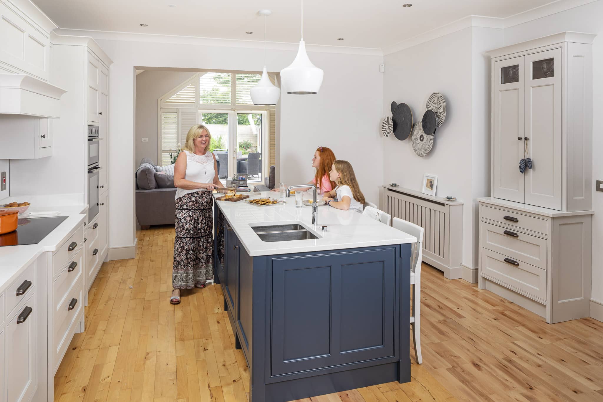
Previously, entering what is now the main kitchen area brought the couple into the dining room area first, with the kitchen located further on in. There was also a fireplace where the kitchen now stands, which had to be removed, with a bathroom and hot-press also formerly protruding into the space.
“We moved that division to allow for a bigger space,” says Peter. “The issue was that the old kitchen didn’t work for us and it wasn’t really functional. The layout was the opposite of what we have now, with the dining table where the kitchen is at the moment. There was also a back door where the tall units are and the shutter used to be a window into a small pantry. So, there was a lot of restructuring before we got down to work.”
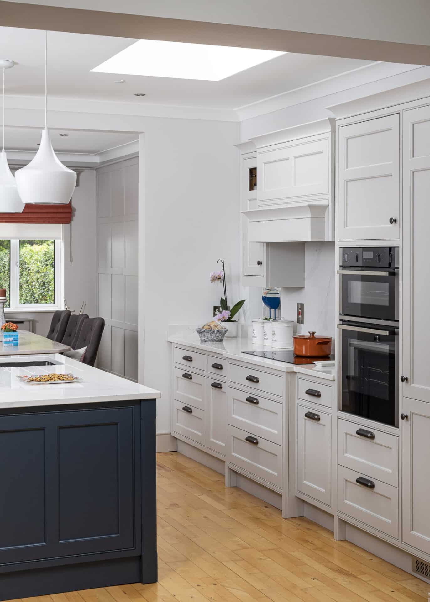
As part of the redesign a roof window was installed above the central kitchen area, immediately bringing more natural light into the space, which “made a huge difference,” says Peter.
Once the plumbing and electrics were installed, fitted lighting was next on the agenda. These include spotlights, along with two pendant lights from Hicken Lighting & Interiors in Dublin, which are spray-painted white to match the overall colour scheme. The pendant lights have a modern design and combine a sharp end with concave lines at the top, flowing down into a cylinder shape.
“We wanted to keep a simple style throughout,” says Peter. “We don’t really like clutter either.”
Practical style
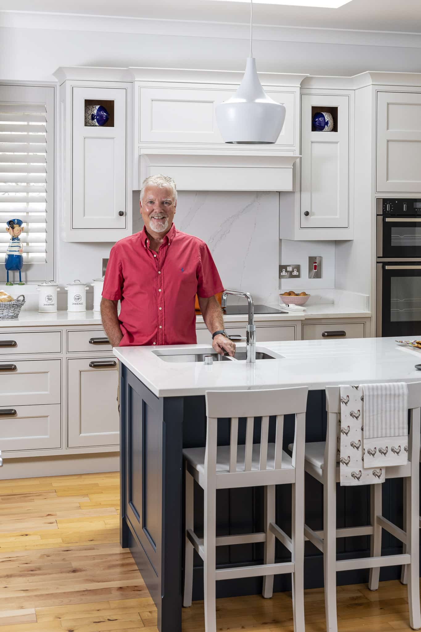
As such, the colour palette for the kitchen, dining and living areas embodies a minimal look, combining a mixture of white, grey and midnight blue tones. The main cabinetry, which was all manufactured and fitted by Peter’s company is an in-frame shaker-style painted in white. The central island, however, contrasts with these more neutral tones with its deeper midnight blue shade. White stool seating complements this and ties in with the kitchen’s lighter shades.
“We didn’t have an island before but have found that to be an absolutely fantastic addition to the kitchen, even though Anne, my wife, was reluctant at first to have the sink there,” says Peter. “She’s now delighted with it. It’s at the heart of the home and is a great place for the grandchildren to come and sit to talk to their nan while she’s cooking.”
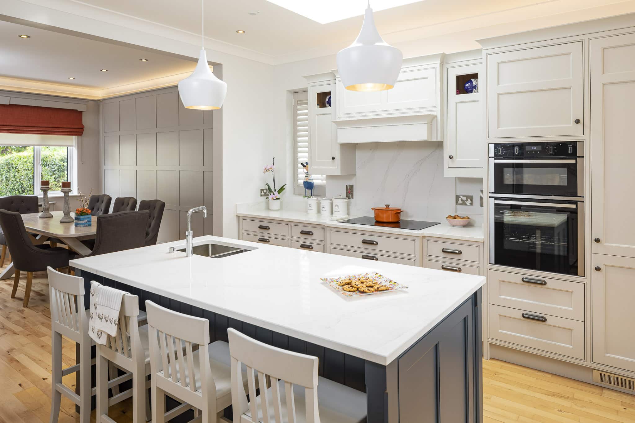
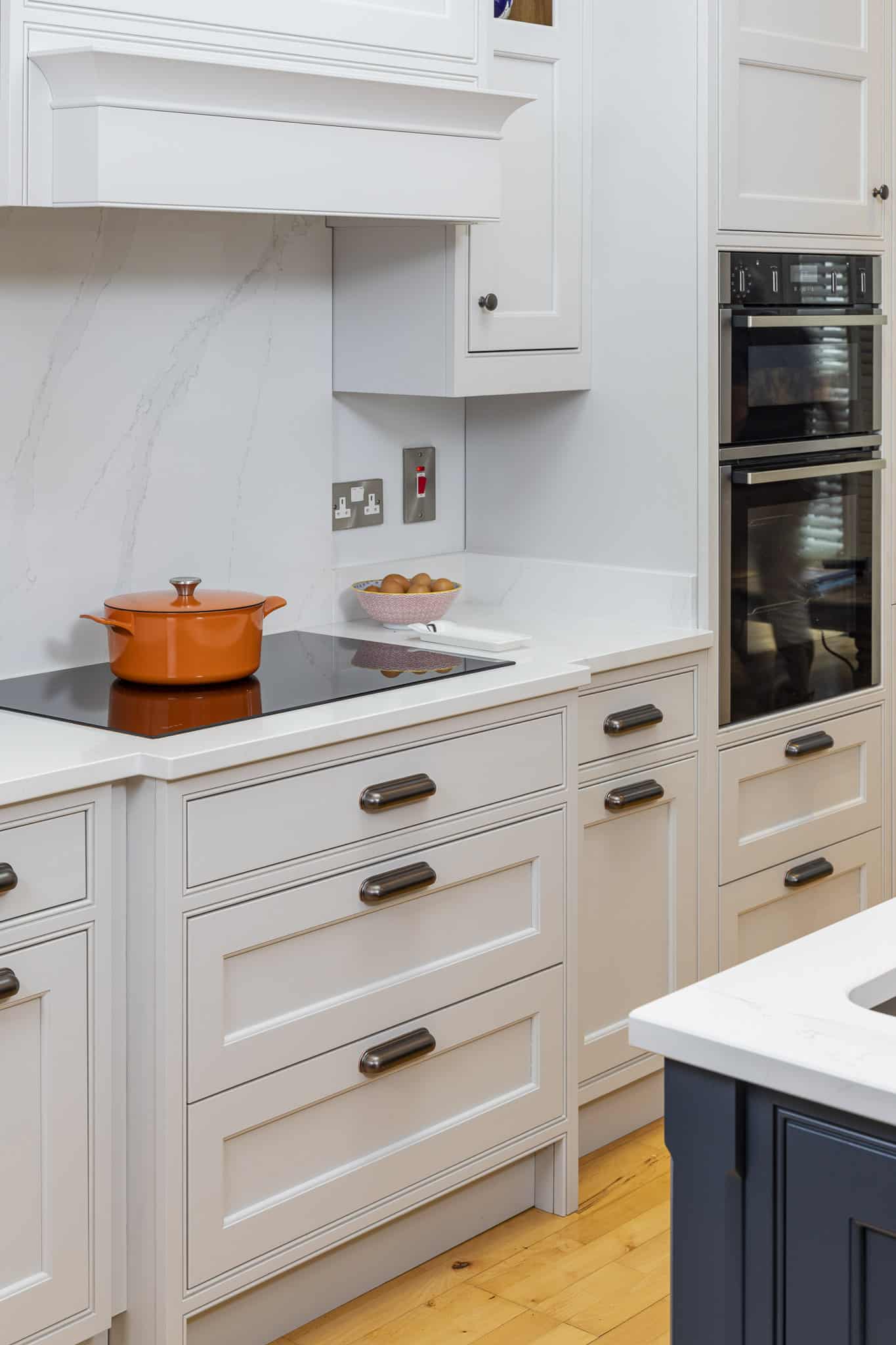
The island has a microwave, dishwasher and warming drawer all conveniently and neatly built in underneath, while up on top is the sink with Quooker Boiling Water Tap. Meanwhile, the countertops throughout the kitchen are Silestone in Eternal Calacatta Gold, so are highly durable and practical.
“Silestone is amongst one of the best quartz materials,” says Peter. “It’s sealed against staining and is very hardwearing.”
The kitchen cabinetry itself is made from solid oak, with the majority of the cabinets fashioned in a pull-out design for added convenience, so there’s no need to kneel down to access their contents.
The appliances, meanwhile, including the oven and induction hob, are all from NEFF, apart from the fridge-freezer, which is by the German brand Liebherr and is also fitted with an ice-maker.
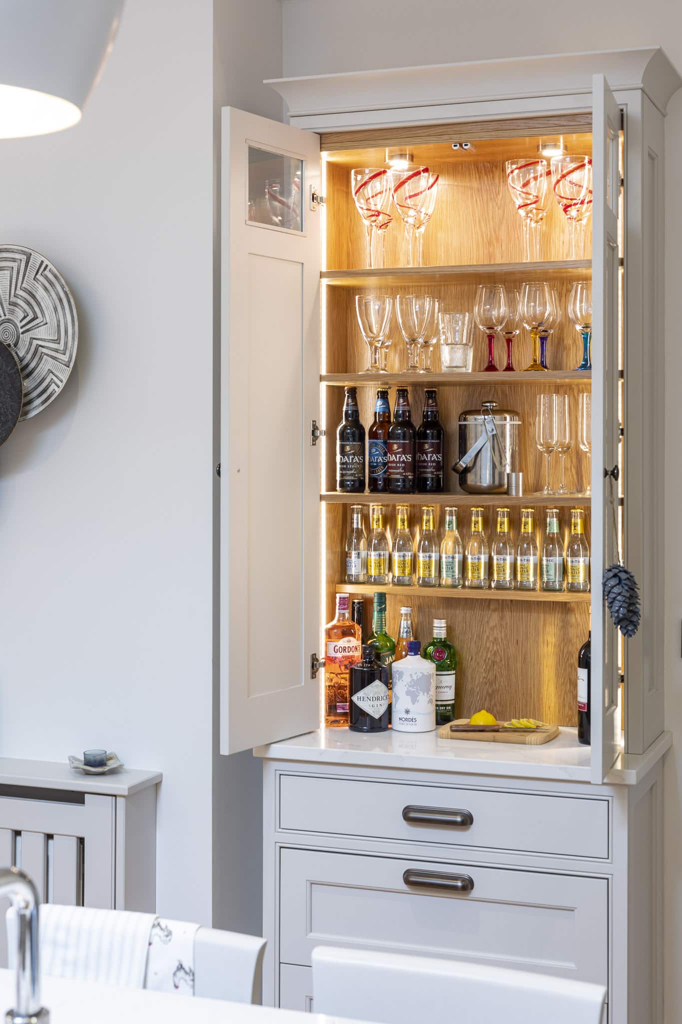
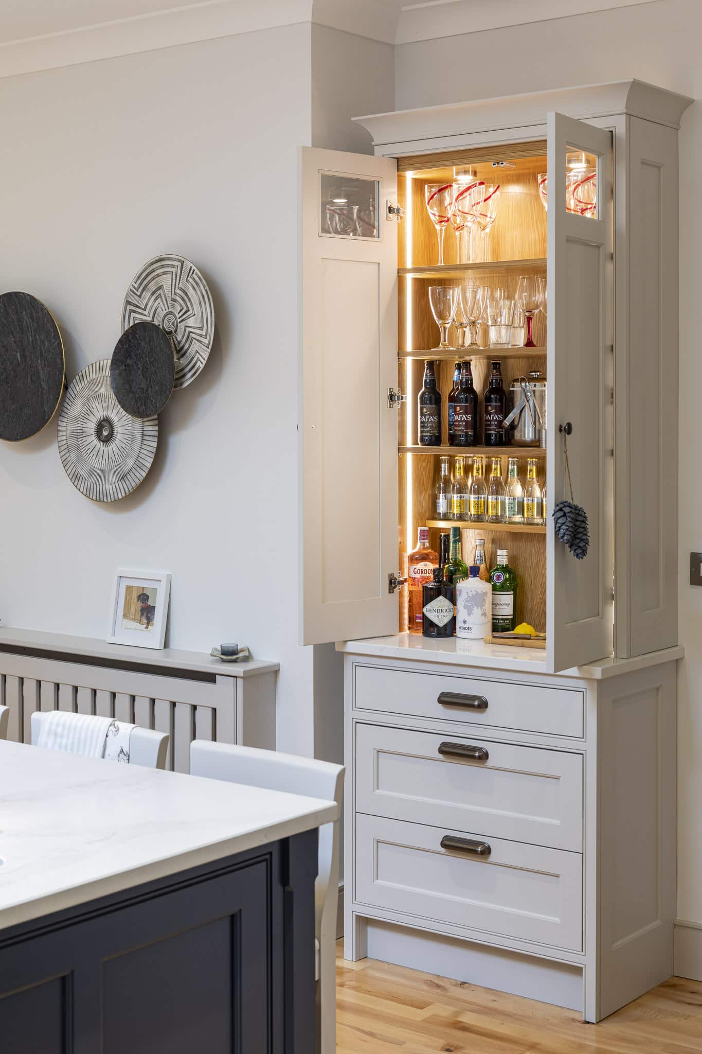
A tall drinks cabinet with quartz top and three storage drawers underneath sits at the entrance to the kitchen, opposite the island – perfectly situated, says Peter, for enjoying welcoming drinks for guests. On the wall beside this is some abstract artwork picked up by Peter and Anne locally which further complements the neutral colour scheme, while the radiator below is also painted to match this.
Relaxed dining and living spaces
To the left of the main kitchen area, a roomy dining space includes a table and chairs upholstered in a darker grey tone, which provides a contrast to the lighter shades elsewhere. A large window to the left lets in ample light, while the table sits in front of a wall newly panelled as part of the renovation.
“We had the table already but the panelling is new,” says Peter. “It’s not something we do very often but it ties everything together and is a nice way to finish the wall without needing to put anything on it.”
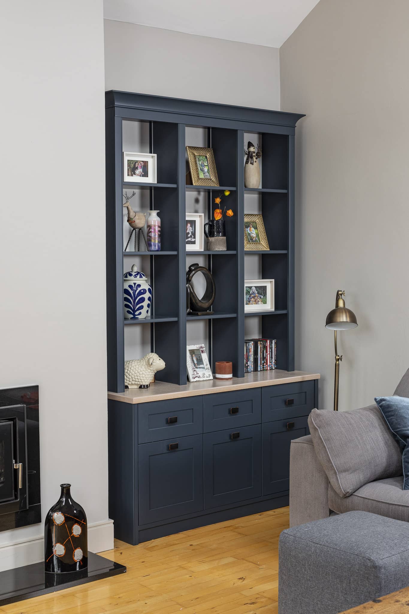
To the right of the kitchen the open-plan space extends into the living area, which was also redone as part of the project. Peter’s company once again made the units in this space bespoke, following the same colour scheme as before, with the display unit echoing the midnight blue tone of the kitchen island. The TV unit is rendered in a lighter shade, while the back of the large unit is painted once again in white.
The flooring throughout these connected spaces is a solid wood beech variation.
“We had the floor before the renovation and were able to get the rest of the pieces that we needed to make it all the same throughout the open-plan space,” says Peter. “Some sections are nearly 20 years old, which just shows how long-lasting it is.”
With a modern new look, lots of natural (and stylishly fitted) lighting and a change in location, this contemporary Dublin kitchen and dining/living space has been transformed into the ideal family space. Functional yet elegant, its up-to-date design now suits Peter and Anne’s lifestyle much better and they worked hard to complete the project within a month.
“We’re delighted with the end result,” says Peter. “We really just brought the kitchen back to the heart of the home.”
Suppliers
Kitchen: The Kitchen Shop
Rooflight: by Velux
Paint: Cornforth White from the Farrow and Ball range
Flooring: Junckers

