In this article we cover:
- Issues working with first architect and lessons learned
- Redesigning the house themselves and then approaching a new architect
- Planning permission and having to resubmit their application
- Finding a builder and costing the project
- Build timeline with details of day to day on site and how they kept an eye on the build
- Choice of systems and designing for solar gain
- Choice of windows and how they framed the views
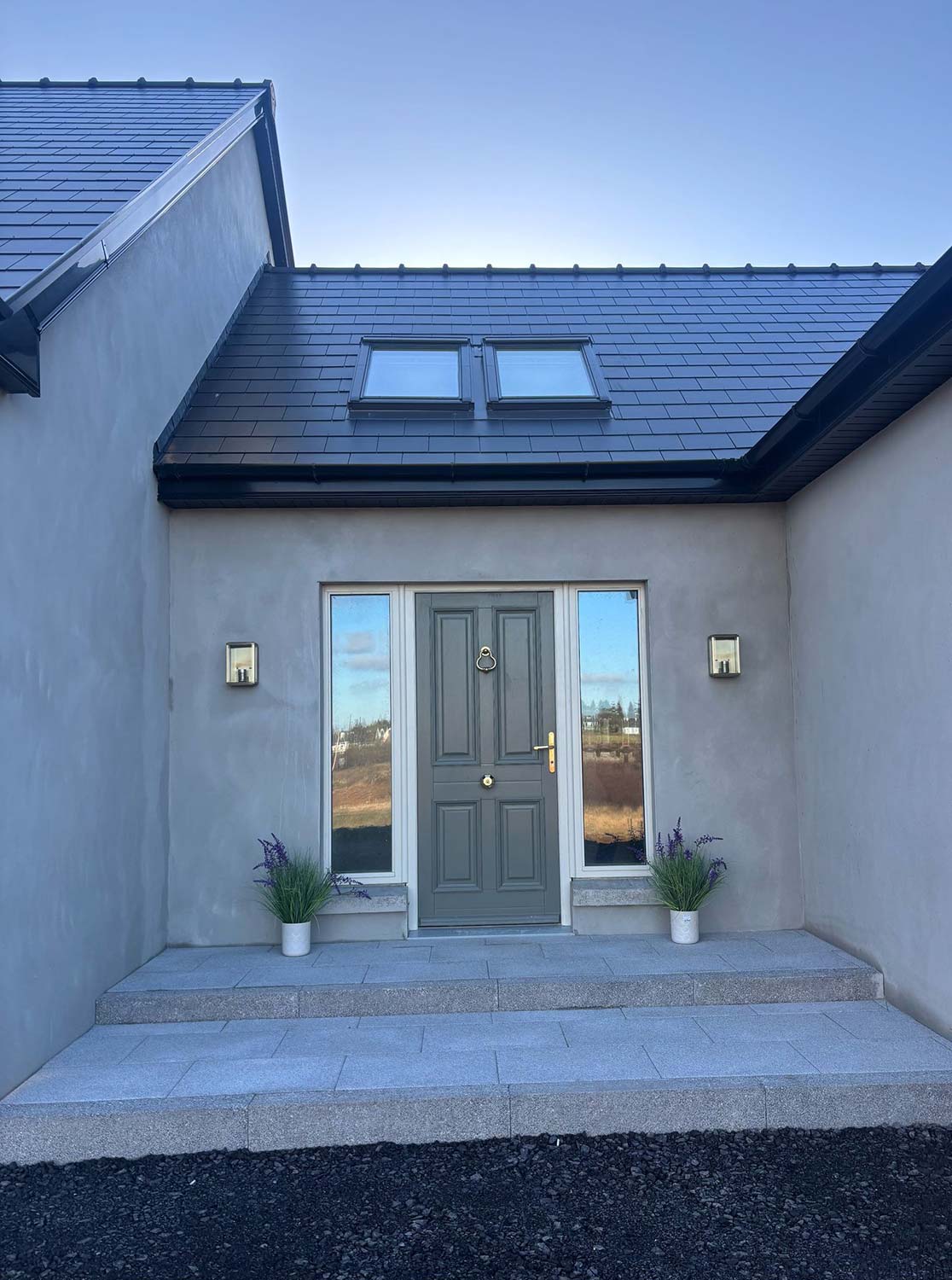
- Choice of low maintenance finishes
- Kitchen design details with tips including costing the worktop
- DIY elements to save on costs
- Top tips to stay on track and on budget
- Professional photographs, supplier list and specification
In 1994 Gerry and Siobhan bought their first home, a 3-bed semi-d, in Belfast to renovate, which they did in 1997. “We were hands on doing a lot of ripping out of the old bathroom, salvaging the kitchen, decorating and spent about £20,000 on complete re-plumbing, electrics, windows, architrave, doors, a bathroom refit and decorating,” recalls Siobhan.
Before: 130 sqm
After: 350 sqm
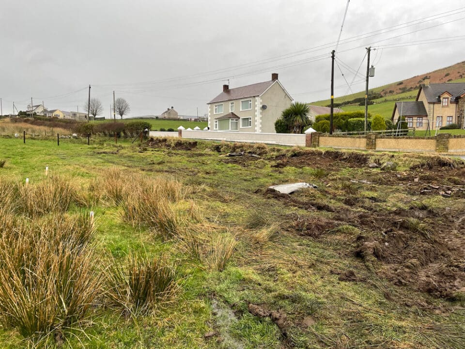
Site: 1 acre farmyard site on 20+ acre farm
Project cost: ballpark £250,000
House value: estimate £450,000
City life lost its lustre and Gerry and Siobhan started to look further afield. “We both grew up in the countryside and secretly harboured a dream of living on a small farm.” “Gerry and I had been actively looking but neither my sister nor we were aware of the planned auction of the house next door to her, an old farmhouse, probably because it was being sold as a farm auction.”
“We had our place in Belfast sold and negotiated a price with the owner, who was happy to withdraw his home from the auction and sell to us. We remain grateful that Norman chose to allow us to be the next custodians of the home that he and his large family of siblings had been raised on.”
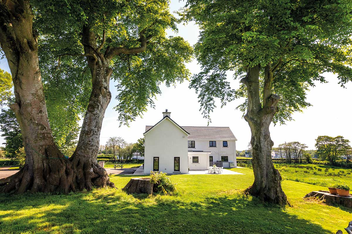
“In spite of the fact that the house was in need of modernisation what swung us was the massive mature beech trees at the back of the garden. Before we did the renovation we got a tree surgeon out and he recommended the removal of three of the trees. We were disappointed but the signs of rot were there and, heavy of heart, we decided to have them felled.”
Farmhouse magic
“When we moved in 1999 we did enough to make the house work adequately for us. We put in a new inexpensive kitchen, a shower, decorated and carpeted. Four more children and nearly 16 years later we started the big renovation!”
There were two previous attempts to renovate the farmhouse. The first was in early 2003 when the couple was expecting their third child. “We had no idea how to pick an architect and went to the yellow pages and selected someone local. We thought that they would somehow, using their arcane architectural skills, wow us with sketches that represented the vision of what we needed and secretly wanted.”
“Long story short that engagement was an expensive lesson as we ended up paying for multiple iterations of plans, each of which was a vision of an impractical, unimaginative home. We did not know what ‘good’ looked like but we knew we were not presented with it.”
“We actually put that experience behind us very quickly and with little rancour; we had a new child coming and we easily made the decision to focus on that,” adds Siobhan. “We finished adding to our family in the first half of 2007; there were then five children and two adults in a house that was way too small.”
“We re-energised ourselves towards the end of 2009 by engaging a new architect (based on recommendation this time). We got as far as planning approval and getting quotes for a replacement dwelling.”
“But a couple of things stayed our hand in progressing with the renovation – firstly family responsibilities meant that Gerry was away at weekends and secondly we were still not happy to demolish and wipe out all that was there before, it seemed disrespectful to Norman. I also was not fully happy with the house design even though Gerry liked the handsome traditionally balanced façade.”
“Once you get into the process it keeps rolling forward and you go with the momentum. I expected my reservations would abate; but they didn’t. Thankfully we took the decision to pause the process at that point knowing we had a few years before planning would lapse. We’d spent a lot of money to get to this stage but felt we couldn’t continue with the project if we weren’t totally happy with it.”
“Circumstances changed in the spring of 2014, at which point our eldest had turned 15.”
“We really needed to create a home the children could bring their buddies back to, we also worried they wouldn’t want to come home from university at weekends.”
“We had learned from previous attempts and decided to tackle the whole thing differently. We focused on what was important to us in the home and put in as much effort as we could muster into capturing that vision.”
Final iteration for major renovation in Antrim
“So from early 2014 we refined what we wanted in the renovated home. We spent several months of effort on this; we’d redraw and park it for a week. It was done to scale on graph paper with sofas, chairs, beds, light switches and we refined this until we thought it would work for our family.”
“I was doing most of the design, but my daughter who is now 17 was interested at the time; she’s very artistic and was inclined to give her input. Gerry wasn’t sold on the contemporary idea at the beginning, he felt incorporating some oak would make the house feel more homely. As the house was getting built he became persuaded that the streamlined style could be comfortable and he now loves it.”
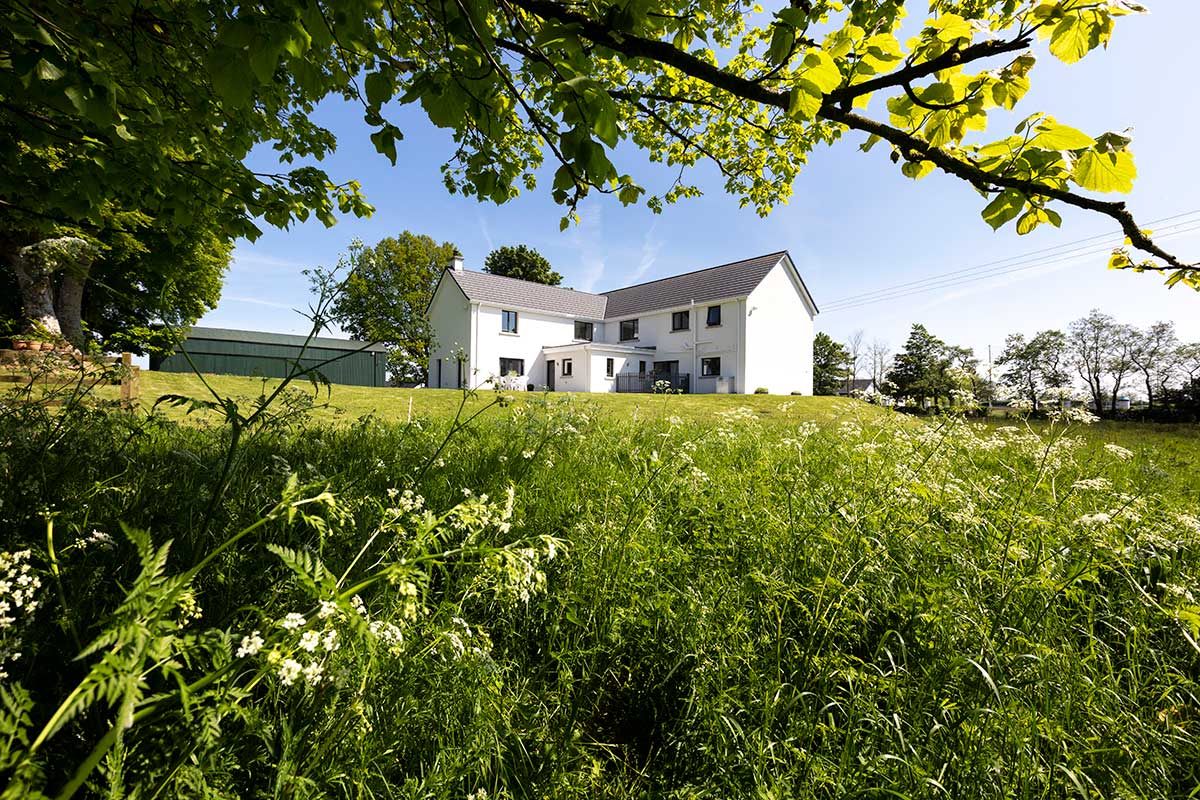
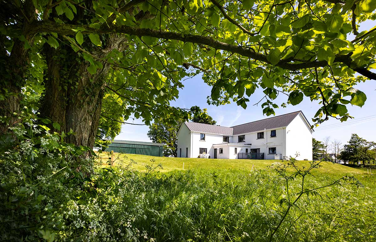
“At the core of the drawings was an acceptance that we were not prepared to eradicate what had been there before; we did not want to demolish the thick stone walls that had sheltered generations before us, even if it was a more expensive approach.”
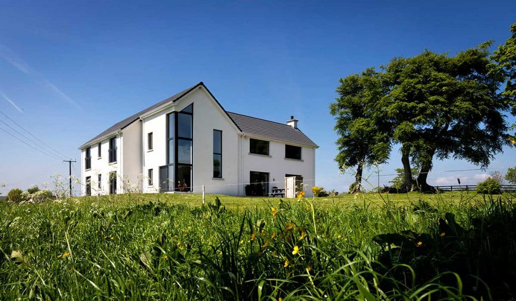
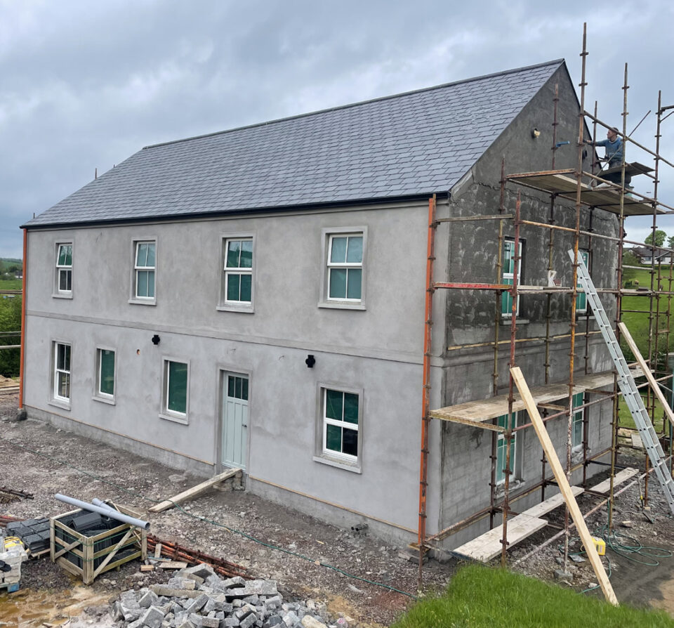
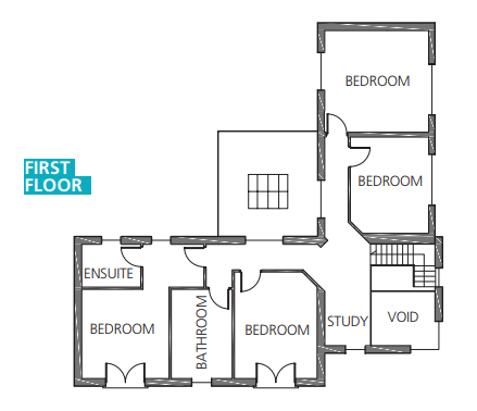
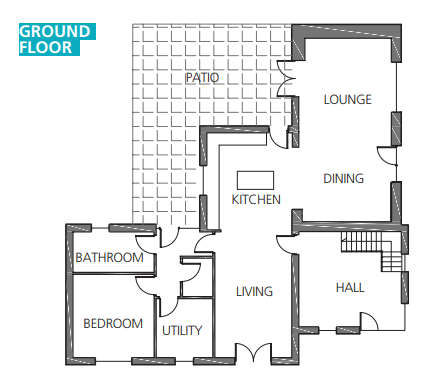
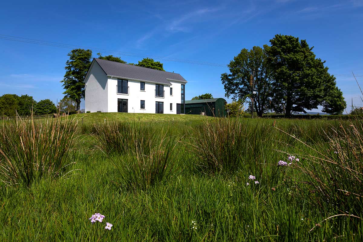
They did however decide to remove the outbuildings that abutted the house. “These had to go as they weren’t worth salvaging and would only have detracted from the renovated building.” The original kitchen, hall, stairs and bathroom were demolished bringing the farmhouse back to a 90sqm two storey shell.
Gerry was very hands on from the beginning and helped with the removal of the internal fittings such as door frames, skirting boards and stud partitions. “Once we were convinced we had a sketch that represented what we wanted we searched the internet and came on the architectural practice that helped us through the process.”

“We loved the online gallery showcasing their previous projects but we were a bit concerned that they might be a bit too lofty for us. As soon as we met Joe and Steven that concern evaporated, they were as down to earth as could be. The whole process went smoothly from that point on.”
“Joe took our sketch and did up the first computer drawings. We iterated back and forth from September to early December, mainly by email to refine the layout. Joe submitted the initial plans in early December 2014, after months of waiting it was rejected – as the scale of the ‘renovation’ was too big, this despite the fact that we’d previously obtained planning permission to demolish and rebuild a house of the same scale.”
“We took it in our stride and our architect resubmitted the plans again with a 3D model to help illustrate the volume of the house. It took six months from initial submission to approval. It was frustrating but nothing we lost any sleep over; we just worked the process.”
Their architects supplied them with the name of a builder that had a good reputation for quality work. “We contacted a number of that builder’s previous customers who gave positive endorsements, so we made the decision to go with him if the quote was reasonable. We had a pretty good idea of what the expected range per square metre should be and used that as our gauge.”
The build
“The builder did up a very detailed quantity survey report to which we added in some things we felt were missing such as retiling of old roof to match new. We had the feeling from the start that we would be able to work with him and during the whole build we never came anywhere near getting annoyed.”
“We each fulfilled our role as builder and client and it worked very well. When we signed the contract we couldn’t believe this really was happening, after all these years of planning.” The builder project-managed the build down to the painting, working from the detailed architectural drawings provided by the architect. “We moved out to a rental property just three minutes away and it was a real chore, especially knowing we’d have to do it all over again in 10 months’ time.”
The entire build took nine and a half months. “I visited the site faithfully early every morning while Gerry got the children ready for school, I went at my lunch break and we both visited the site together in the evening.
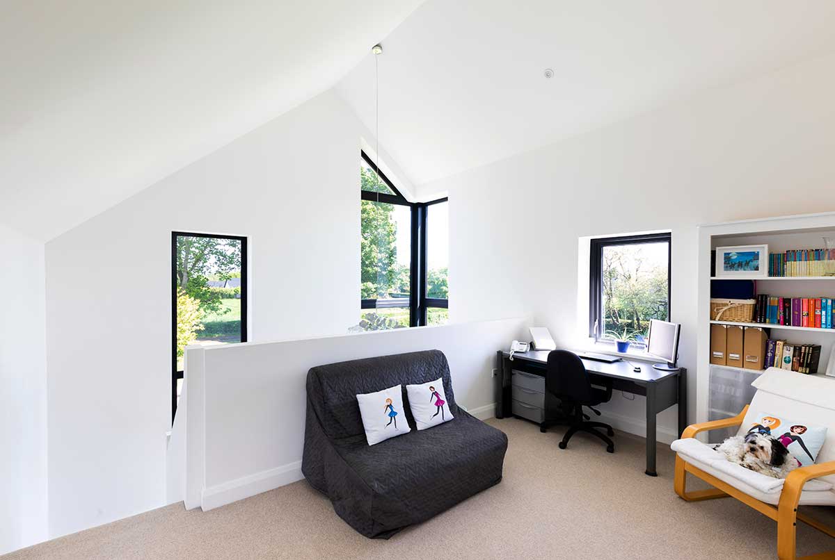
I work from home and because we rented so close it meant I was there to make and confirm any decisions as they needed to be made.”
“We managed the finances and kept track of any items that we agreed to add to the initial contract price, e.g. we upped the spec of the roof light in the kitchen and recorded that as extra owed to the builder. We kept everything in a spreadsheet and shared it regularly with the builder as a record of the staged payments, the extras and so on.”
Heating and hot water comes from an oil boiler and a wood burning stove, with the house divided into five heating zones. “We went with radiators because we didn’t find anyone who would tell us underfloor heating was economical to run with oil. The house is very well insulated – our aim was to maximise heat retention and keep heating costs to a minimum. Even in winter the sun can provide sufficient heat to keep the house comfortable during the day. In the winter evenings the wood burner is the main source of heat with the occasional boost from the oil heating.”
Light, light and more light
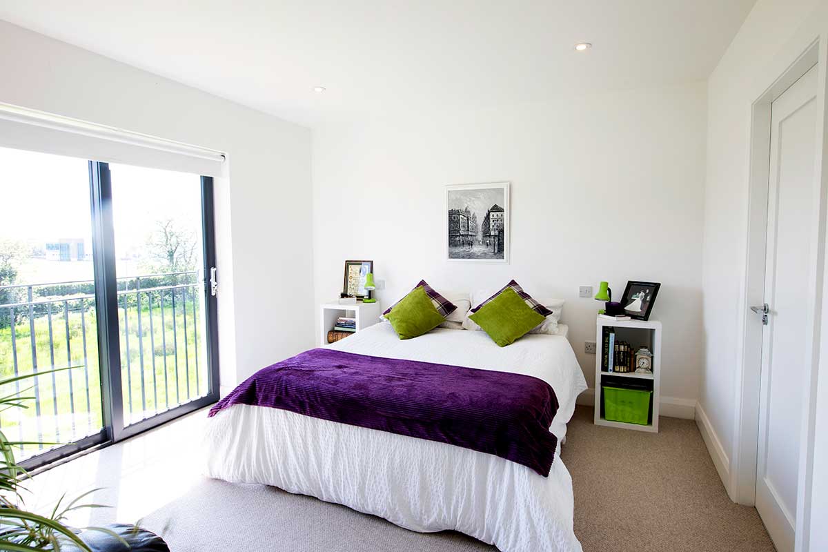
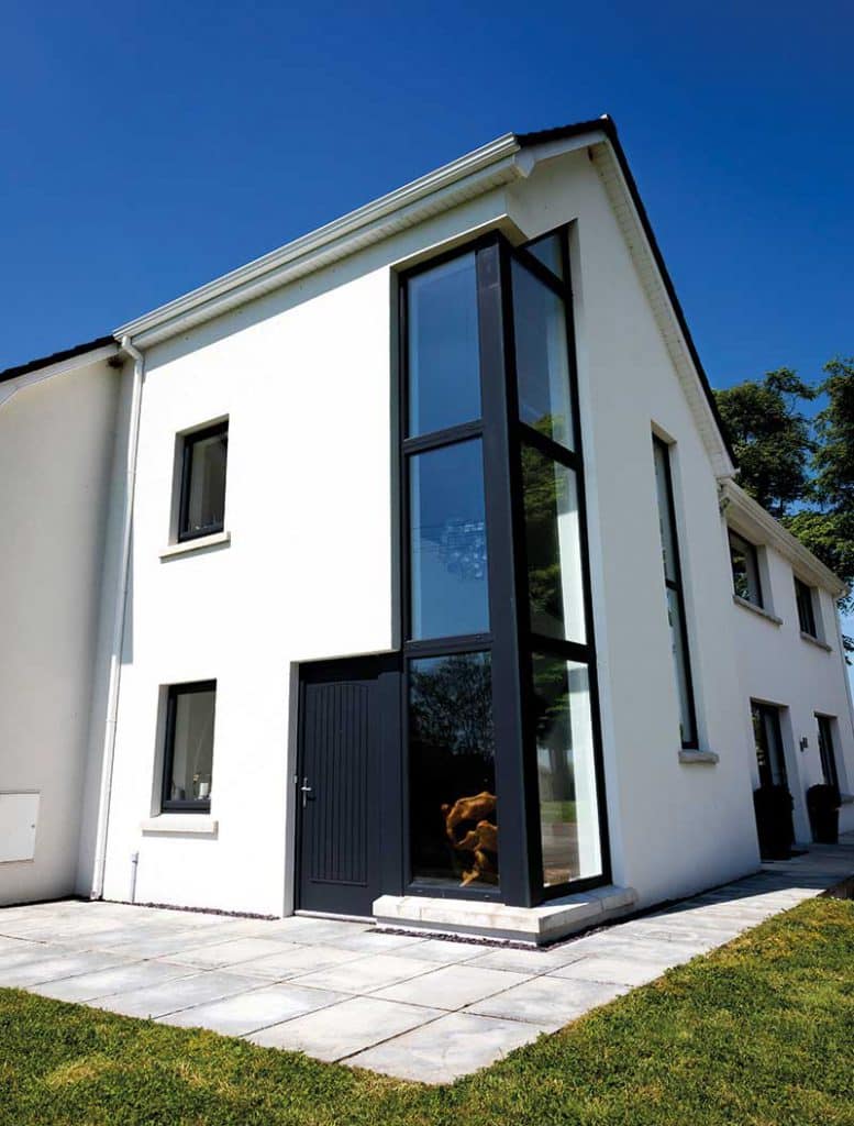
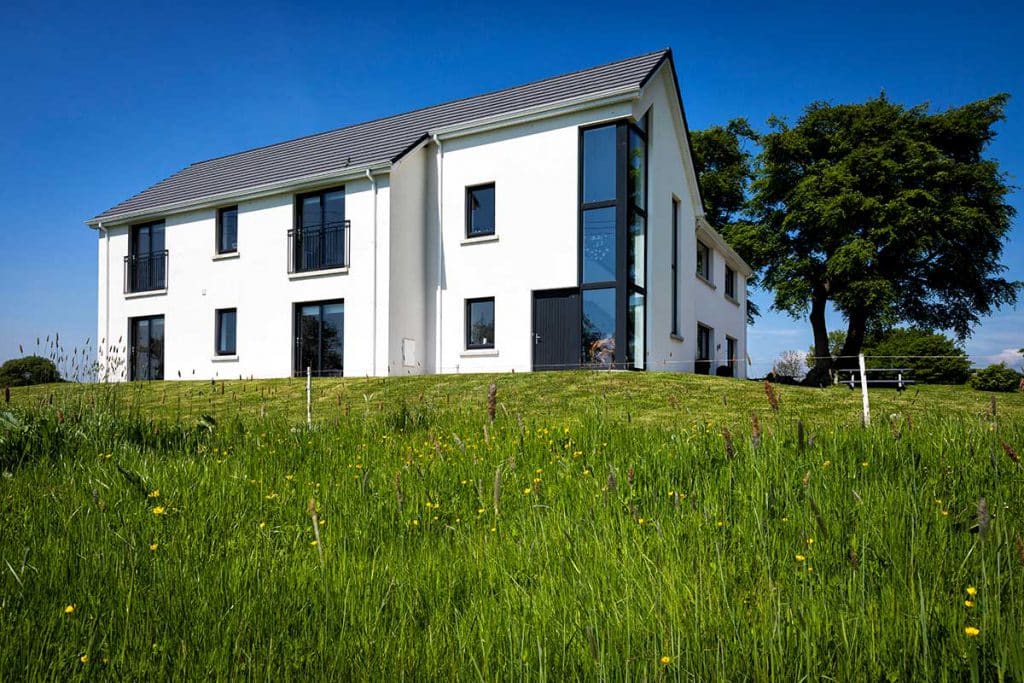
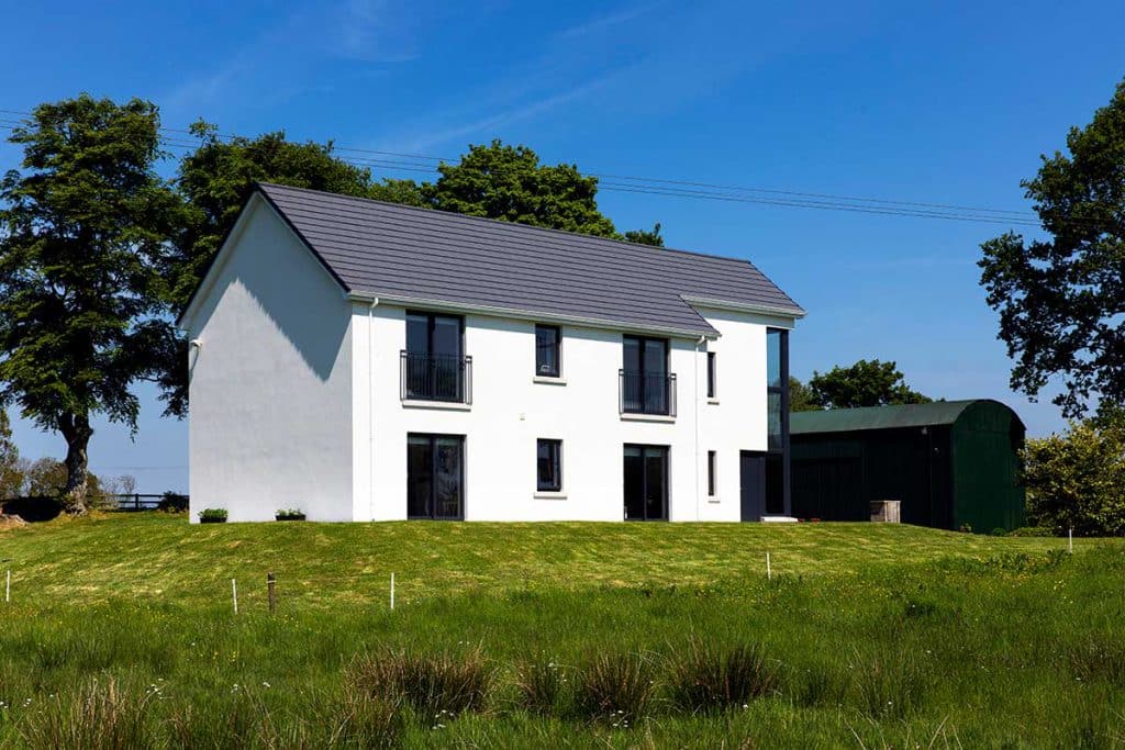
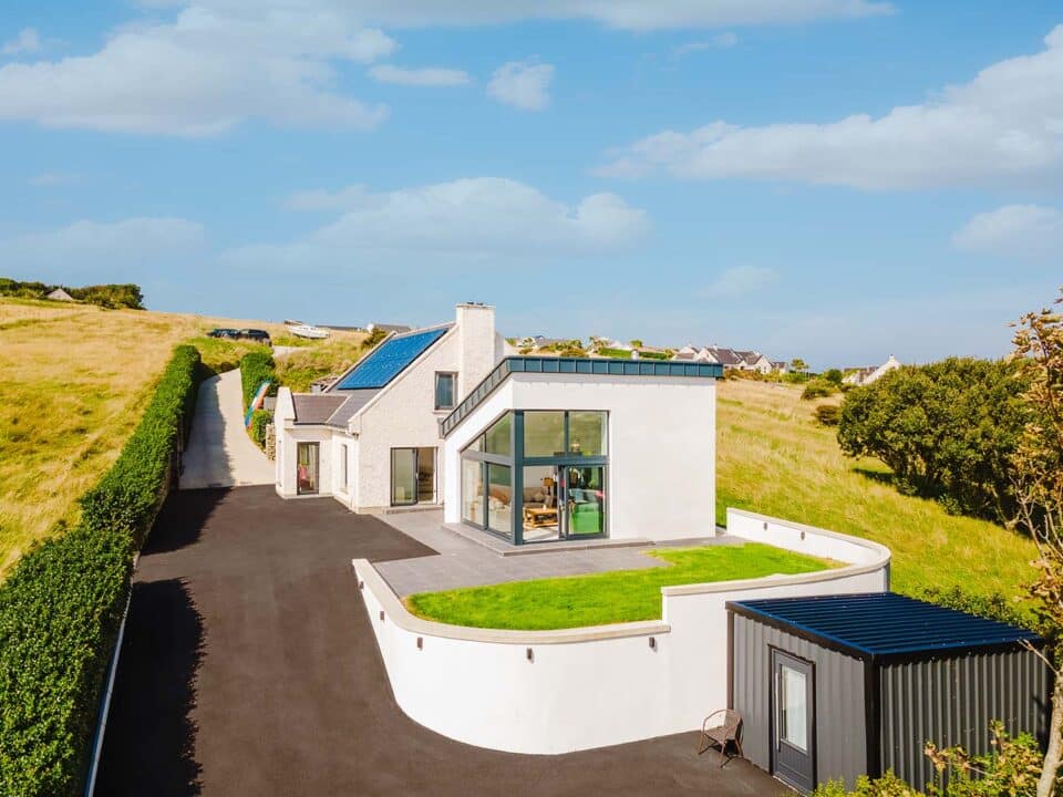
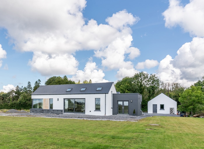
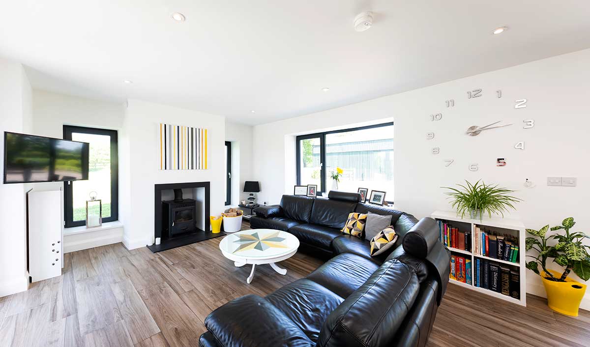
Central to the refurbishment were the windows. “Our house is designed so that we live primarily in the north to avoid squinting through harsh southern or western (evening) shafts of light. We didn’t want to become slaves to adjusting curtains. We compensated for the northern orientation by adding more windows.”
“The family TV room is on the south side but we’ve recessed the television in an alcove 4ftx9ft to prevent glare and no light hits it from the patio window.”
“What I love most is that you can see outside from anywhere in the house. I move freely from window to window. Bringing the glass down to floor level is one of the best things we did,” adds Siobhan.
“This configuration draws the eye out, to pictures that change daily. We opted for grey framed uPVC double glazed units with a chunky profile to act as the picture frames. We only use blinds in bedrooms and bathrooms.” The big windows in the hall are triple glazed to avoid it becoming a cold spot in the heart of the home.
“In a house I always focus on the views, not on what’s on show inside. Also, I don’t like dark spaces, they make me want to leave quickly and find some light. The house was designed to prevent any feeling of being boxed in or of wanting to move to another location.”
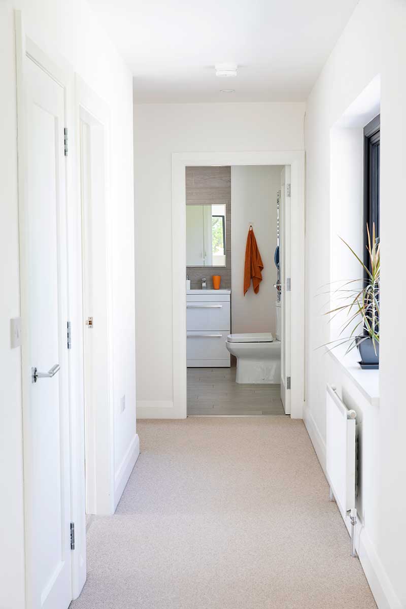
“The earlier attempts at renovating the house had envisioned a sunroom, but we feel that a sunroom tends to make a hallway out of the room adjoining it and can also be hard to heat in winter and too hot in summer.” The staircase adds to the light and airy feel of the house. “We designed it ourselves; we wanted something sculptural, with no spindles to collect dust. It was so tempting to go with glass but with five kids leaving fingerprints it would have been torture for us all.” The choice was plaster.
“Gerry did have an initial concern that the stairs would look 1970s and dated. We also had to figure out how to get a handrail to anchor into the wood, we opted for a solid brushed steel pipe which Gerry got from a specialist steel manufacturer. He had to hacksaw it down to fit in the car! He also needed to get the engineered attachment, which he sourced online.”
The house is now three times the size of the original but it takes a fraction of the time to get it clean, says Siobhan. “It’s tiled downstairs so a microfibre mop does the trick. With seven access points (six of which are glazed to bring in the light) for wet feet it was important to choose a non-slip surface that was easy to clean as we didn’t want to become slaves to polishing tiles. The finish we chose is grainy enough so footprints don’t drive us nuts; all the walls are white and we chose a dark floor to anchor the contemporary design.”
With maintenance and dust-free fittings in mind all the light fittings are recessed LEDs apart from one centre piece in the hall.
Kitchen and interiors
“I worked with the architects to plan the layout; Gerry provided practical hands-on skills (including converting the felled trees into a very useful pile of firewood) and my sister Caroline injected taste. She really came into her own on picking the floor and wall tiles, kitchen doors, and door furniture.”
“Take the floor tiles as an example – we would take a bottle of water (to test the grip) and a small bag of dirt/dust with us to the tile shop and assess the tiles. We hit it off with a local supplier and went with them for everything. They were very obliging during the build about dropping off extra tiles, grout, etc. as needed.”
“We remain grateful for the supplier’s recommendation to use low profile antislip shower trays – with so many girls in the house using hair conditioner it has eliminated a very real danger. We also opted for lightly frosted shower screens in the bathroom; the shower areas are oriented so that the screens afford privacy from the clear glass windows and the frosting disguises the
soap residue on the shower screens.”
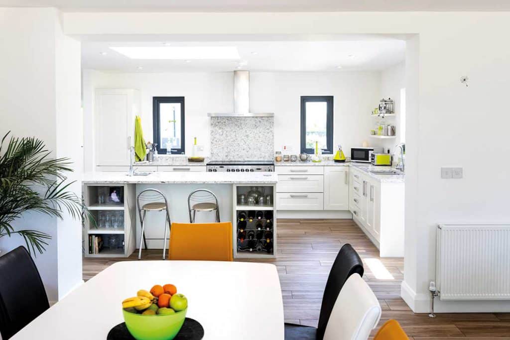
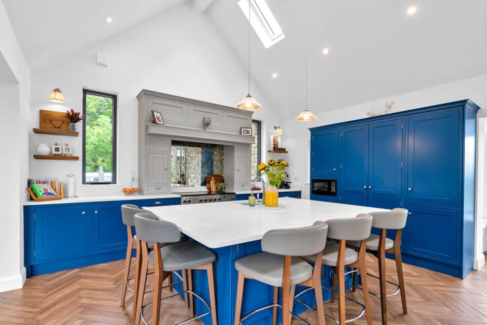
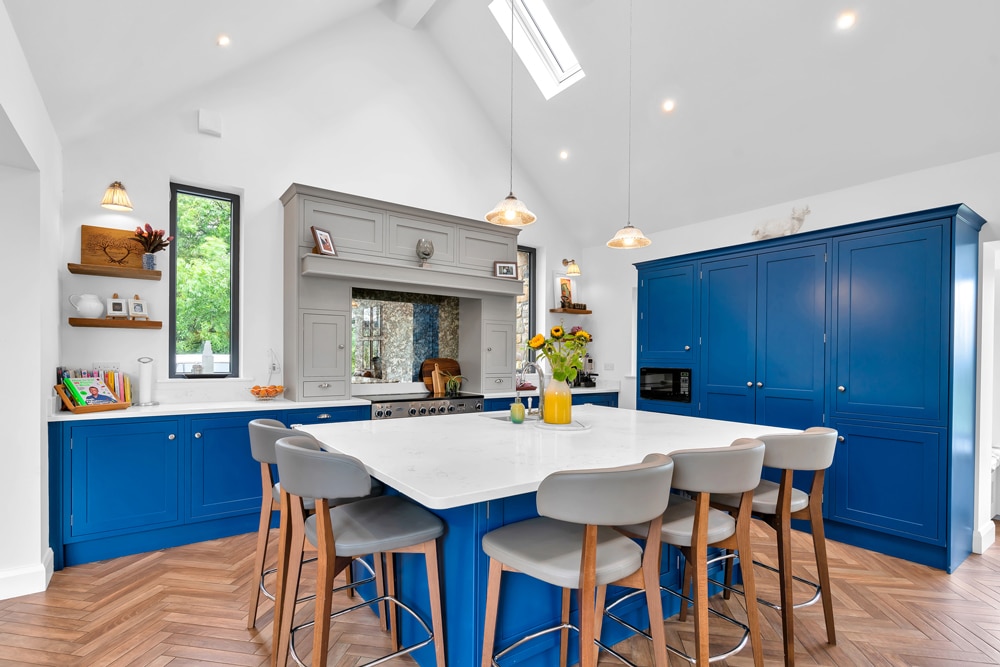
The other family involvement was from Gerry’s brother who has his own kitchen business. “Because he’s based a good distance from us, Gerry and I opted to design the kitchen layout ourselves and draw it up to scale. Again, my sister reviewed it for us, as she had designed her own kitchen and mum’s.”
“I didn’t want high level cupboards as they’re difficult to access for kids and shorter adults like me which can result in injury. We do, however, have a 6x3ft larder (1.8mx1m) cupboard. We drew everything up on squared paper and agreed we would take responsibility for any issues with the measurements.”
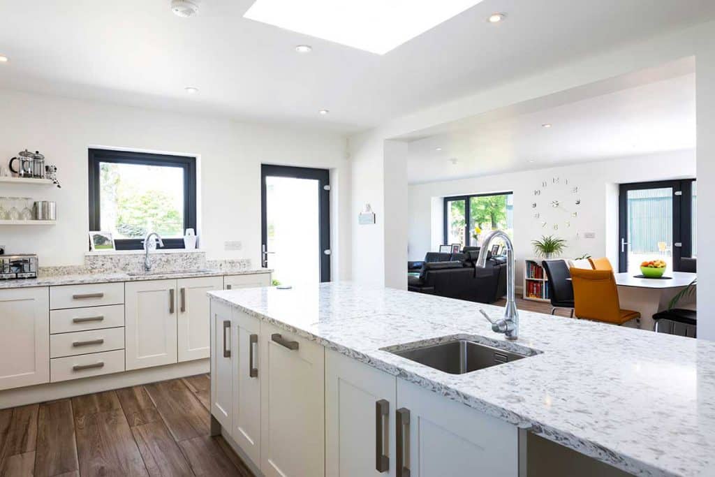
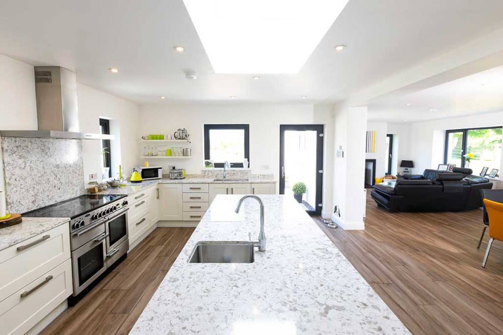
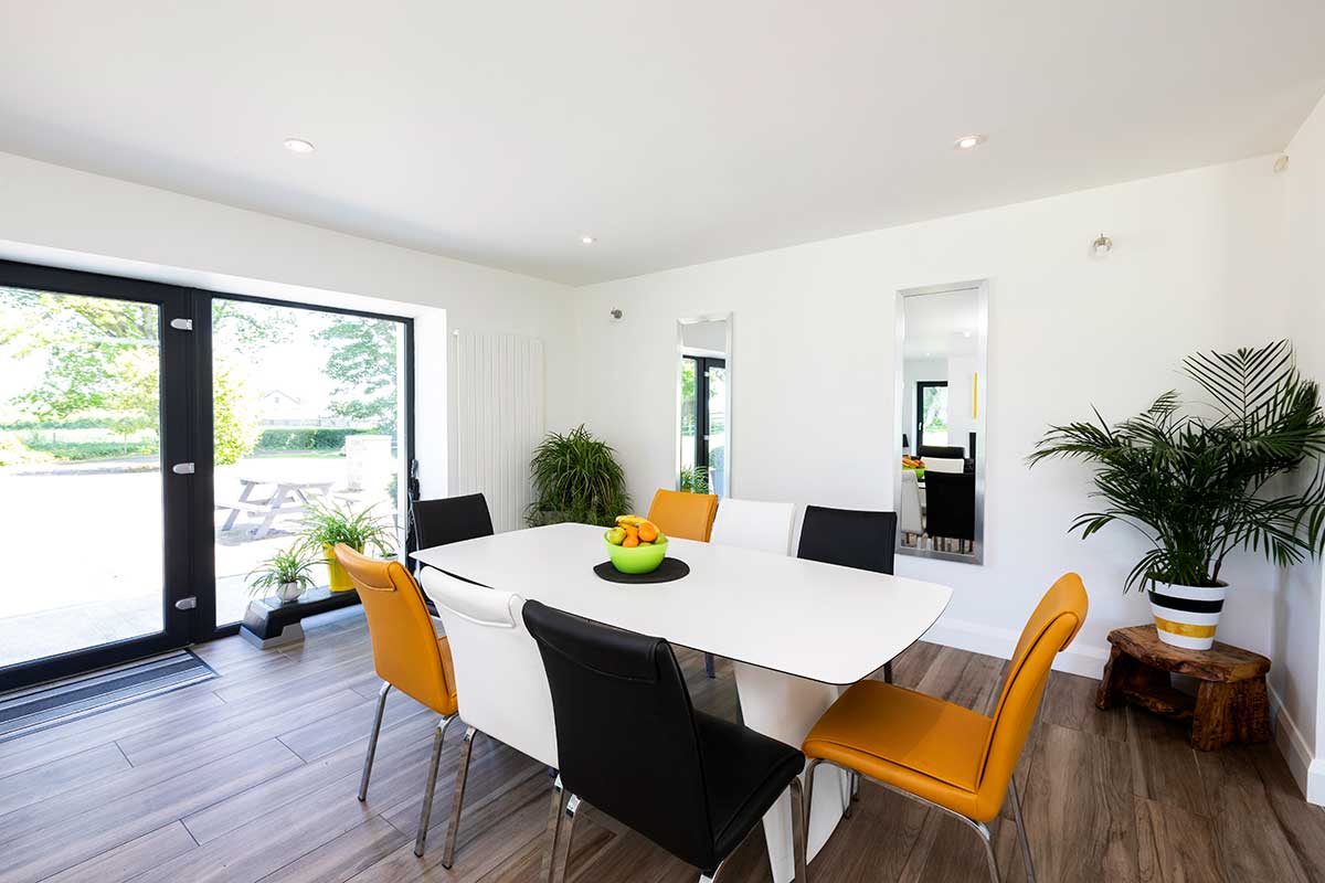
Again with a focus on the practicalities of daily life Siobhan chose foldable island stool seating. “I love big luxurious bar stools but they would have been a barrier to access at the island for people picking up food. The island is large at 3m long but it’s less than a metre wide so we can clean the entire width from one side. At the kitchen window the sill is higher to minimise splashes on the glass.” “We would also recommend having two full size sinks, one for washing up, the other for food preparation. In the old house one of us always seemed to need the sink when the other was already using it.”
“On Caroline’s recommendation we went to get a stone worktop in a warehouse. It was one of the most surprisingly enjoyable afternoons we had; we got a guided tour to see the slabs of granite, marble and quartz. We knew the one we wanted as soon as we saw it and took a sample home to look at for a while to ensure it was right for us.”
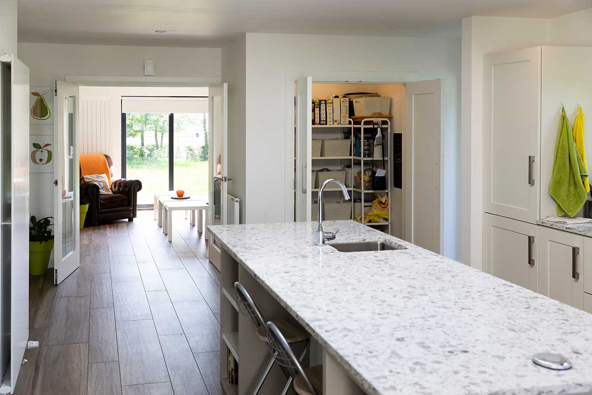
“In our experience the basic cost of the worktop was approximately 40 per cent of the final price as it cost us the same again for cutting out all the holes and moulded edges and then a final 20 per cent of cost on the measuring/fitting. Well spent though as it is lovely. The company we dealt with was notably professional.”
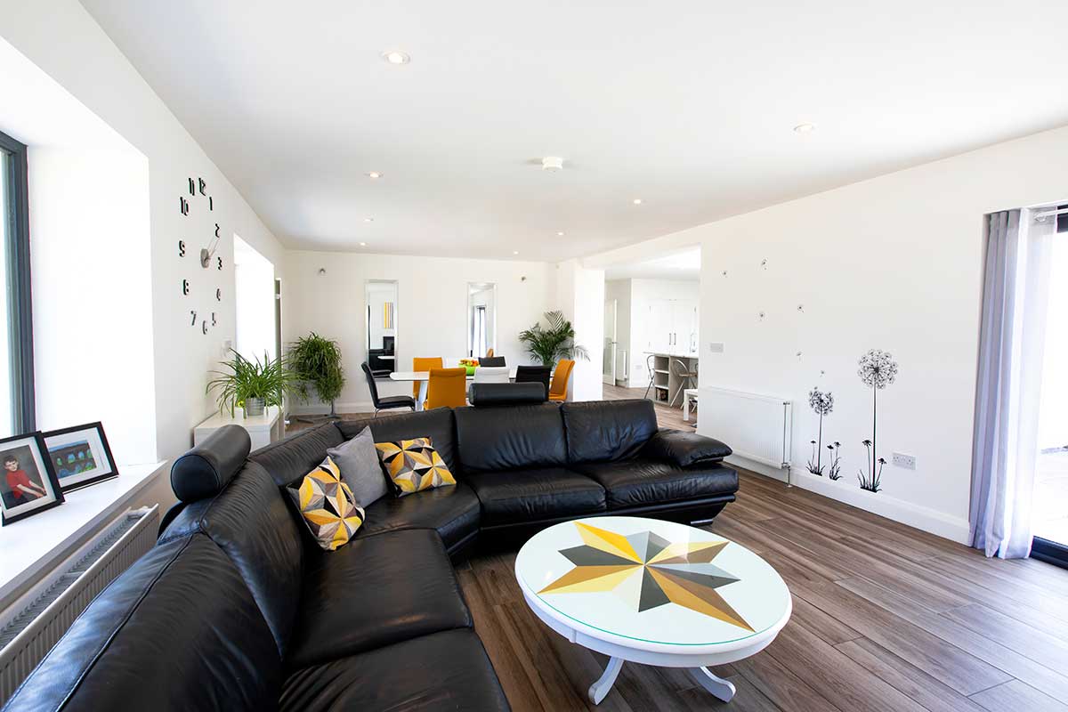
“The 1m circular coffee table in the living room upcycled from our old kitchen table was finished with a damage-resistant Perspex top. Our artistic daughter painted a motif on the coffee table to match the décor.”
“I have to thank my mum for the lovely dining set she got us and thanks to my sister and her husband who bought us the lovely large leather sofa as a housewarming gift.” Overall Siobhan says the process itself is empowering and gives great confidence. “I feel like we were tripping over each other and the furniture before the transformation – everything is now so organised and easy, it makes family life much more harmonious. The experience has truly been life changing.”
Top tips
Choose a good architect that you can work with. Before you meet them, know what you want. Light? Spatial flow? Access to outside? What you put into the design process is what you get out of it.
Think in 3D. Imagine yourself in the home navigating the space. Do and redo on paper to get it as close to what you want. Know where every stick of furniture will sit and how you will navigate it – is there enough space for people to pass each other? Make sure no one has to move their chair to let others past. Is there enough access to get to and from beds comfortably? Think it all through as far as you can.
Use the internet. There is so much material online. Read, research, get ideas and familiarise yourself with relevant building regulations.
Pick a builder with a good reputation and play fair. Get yourfunding lined up and have it ready for the builder; don’t squeeze them unreasonably on every penny. If you pick the right builder and you both have a bit of give and take, it keeps the stress levels right down.
Favourite part of the house? We love it all, both Gerry and I, especially the stairs. I personally love one of the chairs in the dining room area where you can take in the outside through several different windows.
What would you change? We would like sea or mountain views, but on a more practical level the electricity pole is an eyesore and we’re currently negotiating its demise with the electricity board. Our ambition for 2019 is to create a new road entrance with better visibility lines and put in a turning circle in front of the house and really do up the garden. At the time of the build we put in a patio area at the back and a full path all the way around; the builder levelled the site out and we got some extra soil delivered which meant we didn’t have to do much with landscaping up until now.
What piece of advice would you give a selfbuilder? Make sure you’ve given yourself the time to form your own views; every year you refine your dream. Twenty plus years ago we would have gone more traditional in style, it has taken time to mature our view of what works best for us and to develop the confidence to go for it. Be aware that the biggest stress can come from yourself. Be organised, understand your obligations, be reasonable with your architect and builder. Build up the confidence to make decisions fast. Be realistic about how much it will cost, you’ll be in for one miserable ride if your budget is over-optimistic; all our non-builder items were based on retail prices from the start, or a healthy provision was made.
From a practical point of view for us it was very important to be living so close to the build because it meant we could really be involved.
What surprised you? How stress-free it was – apart from a couple of break-ins at an outbuilding on site. Opportunist thieves are always on the look out for builders’ tools. It is important that you ensure you keep your site well secured, especially so in the later stages of the build when you might have lots of electrics or sanitary ware waiting to be installed. If you have bought these yourself then they won’t be covered by the builder’s insurance.
Would you do it again? I have another build in me, maybe in another 10 years’ time, another iteration of our current house. I can’t stop changing it in my head. Gerry thinks I’m joking!
Specification for major renovation in Co Antrim
Existing walls 500mm stone externally insulated with 200mm EPS and silicone render, new walls 100mm cavity filled with EPS platinum beads finished with silicone render, floor 150mm PIR insulation throughout with thin screed finish, existing roof insulated with 400mm mineral wool, new roof 100mm PIR boards between rafters and 50mm PIR under rafters, windows double glazed uPVC low-e argon filled.
Suppliers for major renovation in Co Antrim
Architect: Slemish Design Studio Architects, Ballymena, Co Antrim, slemishdesignstudio.co.uk
Builder: Estco NI Ltd, Ahoghill, Co Antrim, estconi.com
Bathrooms and tiles: Antrim Tile and Bath, Randalstown, Co Antrim, antrimtileandbath.co.uk
Countertop: Lamont Stone, Coleraine, Co L’Derry, lamontstone.com
Kitchen: Gormley Kitchens, Enniskillen, Co Fermanagh, gormleykitchens.com
Kitchen appliances: Donaghy Brothers, Kilrea, Co L’Derry, donaghybros.ie
Insulation: Kingspan, kingspaninsulation.com
Silicone render: K Rend, k-rend.co.uk
Windows & Doors: S. Dooey and Co Windows, County Antrim, s-dooey.co.uk
Photography: Paul Lindsay of Christopher Hill Photographic, scenicireland.com

