In this article we cover
- State the house was in when the couple bought it
- How the renovation project got started
- Working with an architectural designer and hiring a builder
- Full costs including kitchen
- Colour schemes
- Changes on the upper storey
- Dealing with old windows and walls
- Kitchen upgrade details
- Changes they would make
- Top tips for renovators
- Floor plans before and after
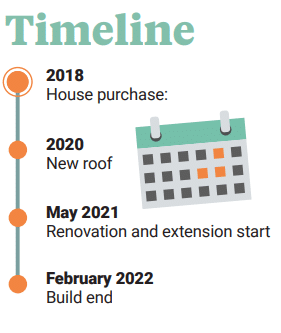
- Suppliers and timeline
- Full specification
Tom and Miriam bought their Drumcondra house in 2018, aware that it was a fixer upper. It had single glazed aluminium sash windows and an outdated kitchen housed in an 1980s extension. “The extension was so rickety, it felt like it might fall if you leaned on it,” says Miriam.
Built around 1906, the house is located halfway along a red brick terrace, originally built by Dublin’s Lemon & Co. confectioners for its factory employees. “The factory sat behind our house, but it has long been demolished and replaced by a modern estate,” says Tom. “Our house is slightly larger than some others on the road, as it would have been intended for middle managers, based on what we have been told.”
House size before and after: 119sqm
Bedrooms: 2
Plot size: approx. 130sqm
Purchase cost: €495K
Renovation cost: €165K
Kitchen cost: €11K
Radiator cost: €4.5k
Heating system: Gas fired central heating
Ventilation: Natural
Build method: Blockwork
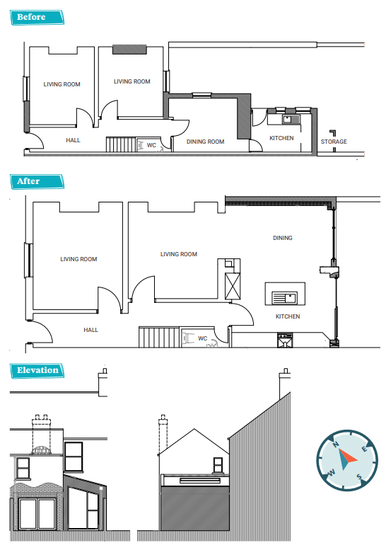
By 2021, the couple had lived in the house long enough to know what needed to be done. They had a clear idea of how to improve the layout, particularly regarding a long, narrow patch of the backyard that was overshadowed by the house. It was wasted space, so they decided to break through the back wall of one of the sitting rooms to build an L-shaped extension, aiming to maximise light.
“Luckily we have a friend who is an architectural designer and he helped put our ideas on paper,” says Miriam. “Our main goal was to bring in as much light as possible. The front of the house is north facing and a bit dark, while the back is lovely and bright. We wanted to remove two small rooms at the back—a breakfast room and the kitchen extension—and create a large, square space. I don’t think we added much in terms of floor space by having the extension, but it makes better use of the backyard and allows the light to pour in.”
Tall order
The back wall of the rear sitting room was removed to create the open plan kitchen, dining and living area – steel beams were installed for structural integrity. Originally, there was a step down from the sitting room to the kitchen level. However, when reinstating the floor, their builder levelled off the open plan area to meet the hall level. “Tom is very tall, and when I first saw the new kitchen space I felt the ceiling was too low. It needed that step down to allow adequate height. Luckily our builder is a very patient man, so he lowered it without any complaint at all.”
“As it’s just the two of us we decided we didn’t need to try and fit in a utility room. Instead, the dishwasher and washer dryer are integrated into the kitchen island. At the back of the kitchen, there’s a bifold door and a large floor-to-ceiling picture window, with a rooflight above the kitchen table.”
“We painted the entrance hallway in slightly contrasting neutral tones using shades of white, added dado rails and carpeted. The front sitting room, which retains its original cornice, is painted a navy blue shade. In the rear sitting room area, we reinstated the cornice to match the front room. We salvaged two Drumcondra fireplaces from a salvage yard and installed them in each sitting room.”
“On the first floor, we slightly extended the bathroom, adding a walk in power shower with a black shower head and black slate tray with bottle green tiles on the walls.”
“Up four steps and you reach the guest bedroom which we papered in a bright and lemony yellow print, with two bespoke double wardrobes and a white wrought iron fireplace.”
“Our bedroom spans the full length of the house, featuring two large sash windows and an original black wrought iron fireplace. A lot of houses on the street have divided the front bedroom into two, but we didn’t feel the need for an extra bedroom.”
“The walls were covered with over 100 years’ worth of wallpaper which was meticulously removed by our painters. Although it seemed that every wall in the house would need skimming, in reality we only had to skim the front bedroom and front sitting room. The painters managed to restore the other walls using filler and their expertise.”
“They were phenomenal. The hallway looked dreadful after we removed the wallpaper, but they transformed it beautifully.”
“When we moved in, the single glazed windows meant the house was cold and noisy, especially during the ‘Beast from the East’ storm in 2018. We replaced the front windows with composite triple glazed sash windows in a cream colour.”
“We upgraded to period style radiators and installed a new gas boiler. Along with the triple glazing, we insulated the rear of the house and added extra insulation to the roof. The house is now really warm and cosy.”
“We have a loft space, and many neighbours have converted theirs, but we didn’t consider it necessary since the house already meets our needs.”
“Before this extension, around 2019, we decided to reroof the main part of the house after finding some dropped slates on the street. We replaced all the gutters, although, in hindsight, I regret not repairing the original ones.”
Adapt and overcome
In the small bedroom on the return, they encountered a major issue while removing the window frame. “We had previously removed two full chimneys from the ceiling down to the ground, which destabilised the back wall,” says Miriam. “When the granite windowsill in the bedroom was removed, one of the surrounding bricks moved. Using all the original bricks our builder rebuilt the entire wall in a few days. He did it all in a very relaxed manner, he understood the vibe—no fuss, just get it done.”
“We lived in the back of the house throughout the renovation work, which was extremely challenging. At one point, we had no bathroom or kitchen, relying on showering at work. Tom worked from home and we ended up living in just one room during the dead of winter. For a week and a half, when we opened our bedroom door we were looking directly onto the street – the wall was completely gone.”
“We were brushing our teeth and washing our cups in the half sink in the downstairs toilet, that’s all we could do. We had no washing machine for a long time as well. It was extremely hard going, but the truth is, if we had moved out and tried to rent in this area, we wouldn’t have been able to afford to carry out the project.”
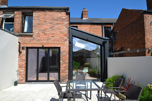
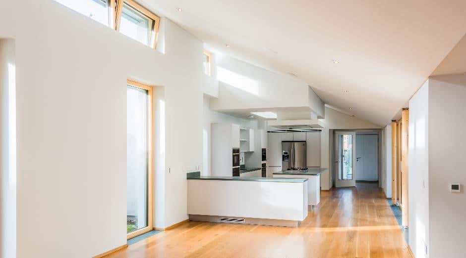
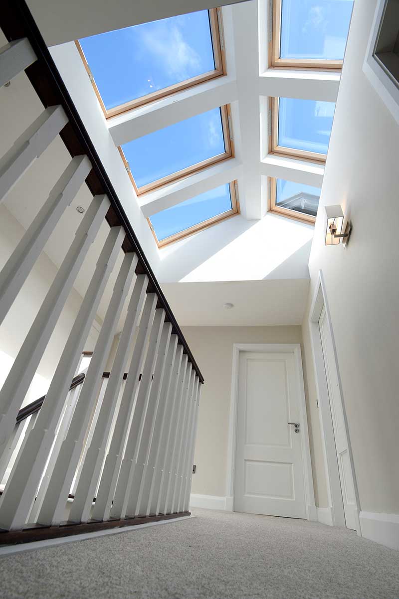
The extension roof, that covers the kitchen, is slanted to almost 45 degrees. “We installed a large rooflight which is boxed in, so you don’t see the frame from the inside. It makes it look like it’s floating. The first iteration of the rooflight leaked, but the supplier immediately replaced it. The original version opened, but it looked clunky, so we replaced it with a fixed one that looks much better, it’s almost flush with the roof.”
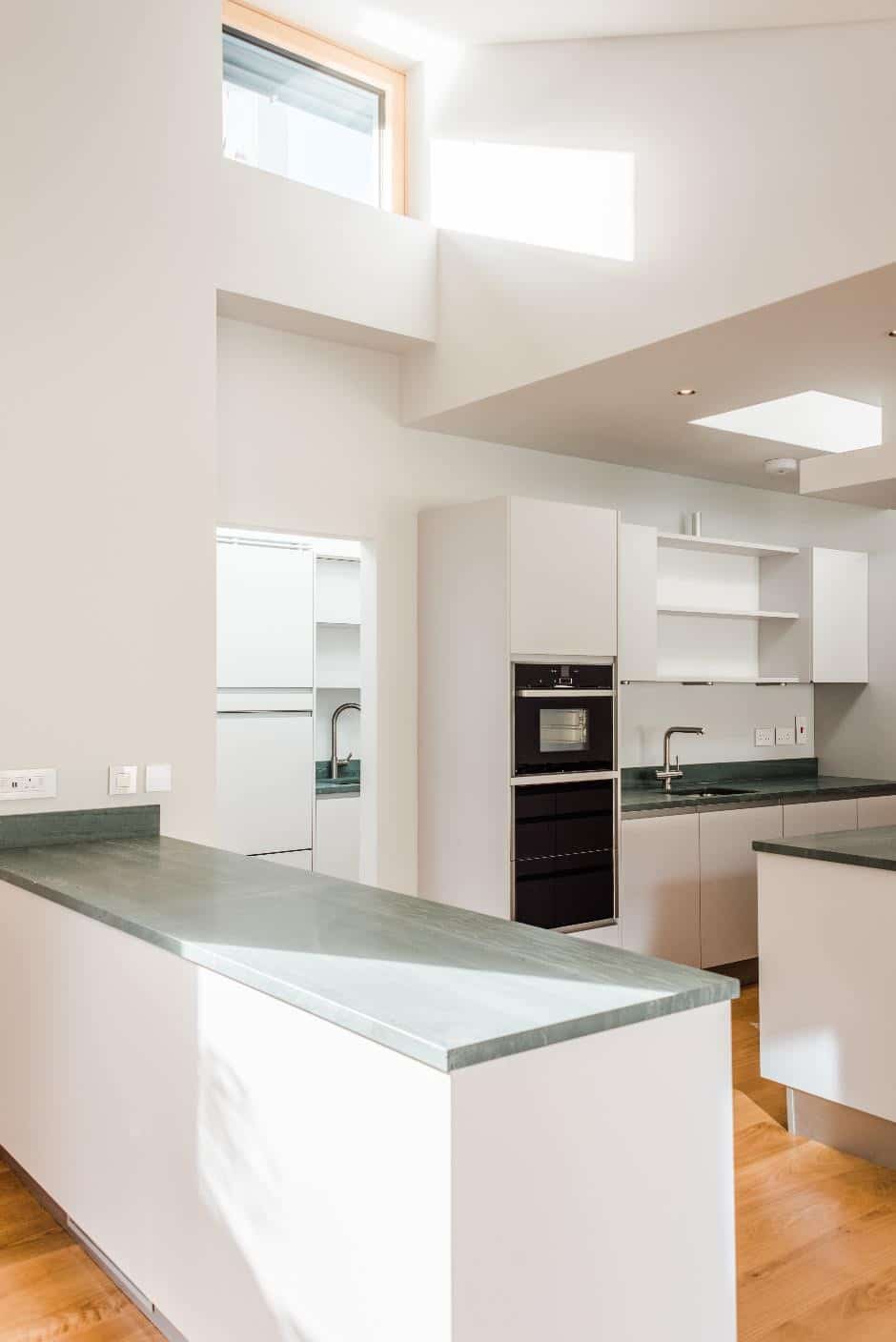
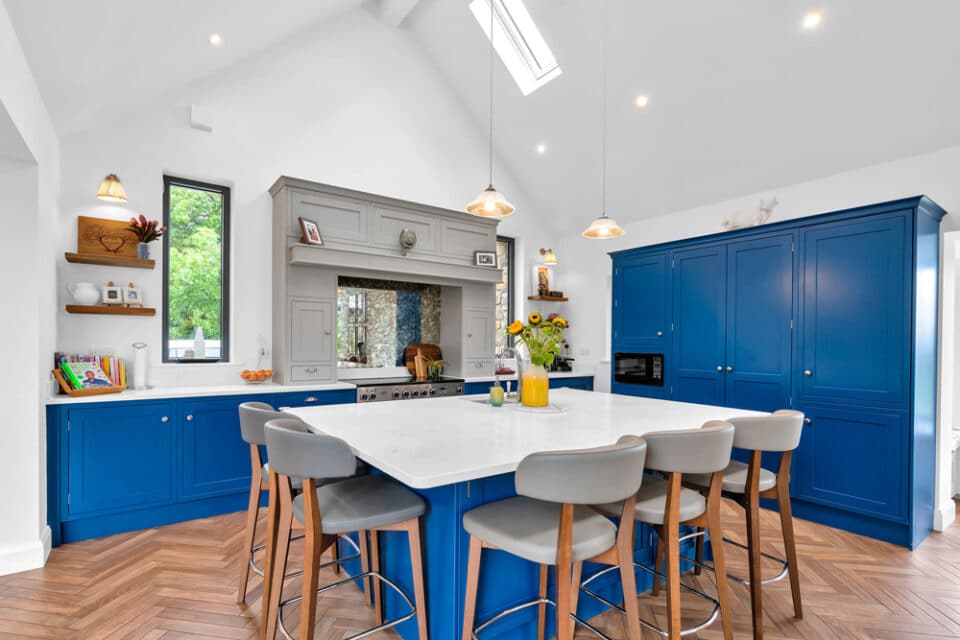
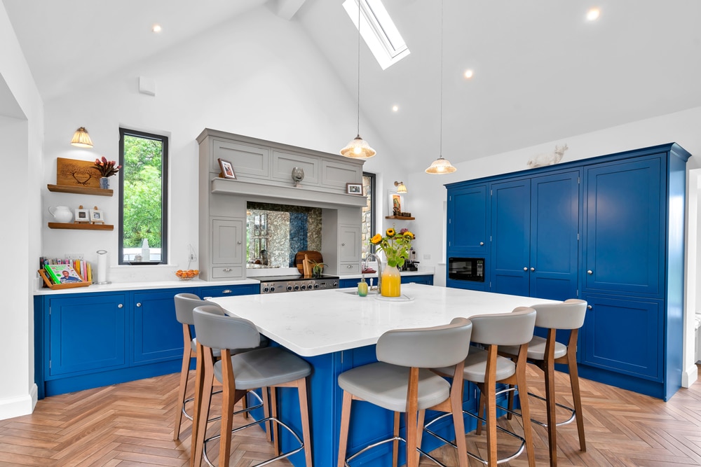
“Our kitchen is built in a shaker style with mullion top doors. The doors are standard height and don’t reach the ceiling which is quite high. We chose white quartz for all the worktops and installed a large pantry in a perfect spot between the back sitting room and the doorway.”
“It has double doors and a white marble worktop inside. Our kitchen guy was great – just a small startup – he did everything we wanted. We have a mixture of brushed brass knobs and cup handles, a Belfast sink and a brushed brass tap unit. He also organised and supplied all the appliances.”
Style blending
“We focused on heritage colours with modern flashes of colour. We chose a burnt orange and a navy sofa for the front sitting room. The carpets upstairs are all white or cream, and there’s a lamb’s wool carpet runner on the stairs. We splurged on the stairs. Although the floors upstairs can be sanded, we chose to carpet because, by that stage of the renovation, we had reached the limit of endurance.”
“At the front of our house, we dug out this small area and put down gravel. There’s just a step into the house, and we added a new composite front door in a heritage style shade.”
“In the rear garden, we laid slabs and made flower beds from the granite windowsills. We planted lavender, rosemary and other plants. The entire extension is painted black, and all the doors and window frames at the back of the house are black against the red brick. We added lighting on the wall, above the lintel of the extension and above the bifold door.”
“Despite it being a modern extension, the interior still reflects its period style. The bifold door is framed by red brick, making it look integrated with the original building, and the black render complements it.”
“Our builder was fantastic—nothing was ever a drama. While many others said ‘no’ to our ideas, PJ, our builder, always said, ‘That’s not impossible.’”
“The renovation took longer than expected, as we added and took away elements throughout the process. PJ worked mostly alone, with occasional help for the timber roof and demolition.” “We’re delighted with how the house turned out. We’re particularly proud of the kitchen, which we think looks great. We had excellent people working for us and we put a lot of thought into the design. The house is lovely and warm, especially the extension.”
“We’re getting married this year, which adds another layer of excitement and anticipation. The house feels like a true home now, and we couldn’t be happier with the transformation.”
Q&A with Miriam
What is your favourite room?
I find myself relaxing in the back sitting room a lot because it’s so bright and cosy. My favourite design element would have to be the way it blends our modern tastes with a heritage feel. It’s a modern take on the classic Edwardian style that really appeals to me.
Tom really loves the kitchen, especially the big window at the back. We decided to expose the red brick in there, and I’m absolutely in love with how it turned out.
What would you change or do differently?
The bathroom. If I did it again, I wouldn’t spend as much money on fixtures, because it’s just a bathroom at the end of the day. I would keep a better eye on timeframes all the way – lead times are a big deal – I would have put a bit more pressure on some of the trades, they were quite relaxed.
What surprised you?
How fragile old houses are. You touch something in an old house and a problem will emerge somewhere else.
What single piece of advice would you give a renovator?
Just make sure you have a contingency on your budget because it is going to cost more than you think. The budget is a best laid plan really, and other things will emerge and when they do, you have to tackle them – you can’t pretend that it will go away.
Would you do it again?
If I won the lottery and could afford to move out and live somewhere else, I would definitely do it again. But not if we had to live in it as the work was being done.
Spec
Extension walls: 215mm hollow concrete block wall with selected nap plaster finish, 125mm PIR insulation internally, plasterboard, skim, U-value 0.16 W/sqmK.
Extension floor: 50mm PIR preformed perimeter strips to floor slab along door threshold, 150mm reinforced concrete slab with power floated finish, 110mm PIR on radon barrier on 50mm sand blinding, compacted hardcore layers, U-value 0.13W/sqmK.
Extension roof: bitumen flat roof single ply torch on membrane on 100mm PIR mechanically fixed to 18mm WBP plywood, on 75mm PIR fixed between joists. Finish roof edge with powder coated aluminium trim. WBP plywood on thick firring pieces starting in cross section 50mm high x 50mm wide so as to create central gutter depression. Vapour control layer to underside of joists suspended ceiling (with two layers of fire plasterboard and 25mm mineral wool slabs) finished with 12.5mm
plasterboard and 3mm skim coat, U-value 0.13W/sqmK.
Windows: U-value for all including rooflight 1.2W/sqmK, colour: Grey RAL 9011; aluminium cill to match.
Suppliers
Architectural design
Joe Fallon Design, joefallon.com
Engineer
ONCE Consultant Engineers, once.co
Builder
PJ Higgins, mobile 086 8546120
Painting
Brendan Mullins Décor, mobile 086 1521305
Kitchen and wardrobes
Bespoke Kitchens and Wardrobes, mobile 086 2436175
Windows and folding doors
Vindr, vindrvs.com
Plumbing
M and R Plumbing and Heating Ltd
*NI calling ROI prefix with 00353 and drop the first 0

