[powerkit_collapsibles]
[powerkit_collapsible title=”COSTS” opened=”true”]
Bunglaow upgrade total cost: €120,000
Studio upgrade total cost: €30,000
[/powerkit_collapsible]
[powerkit_collapsible title=”BUILD SPEC”]
Plot size: 0.3 acres
Bungalow size: 167sqm; 1797 sq ft including the Garage
Studio size: 40 sqm
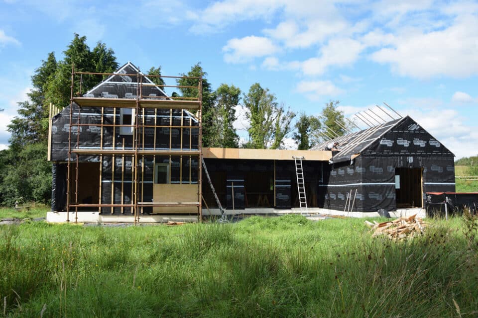
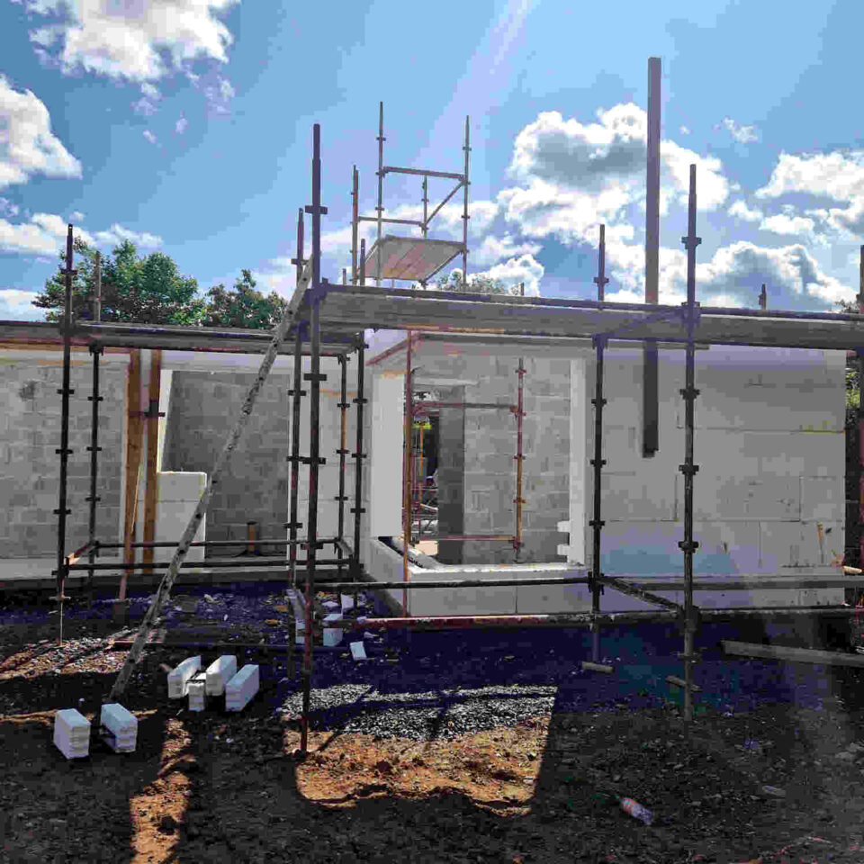
Insulation spec: House: new walls 300mm cavity with 60mm PIR boards; existing walls 70mm PIR board; roof to new and existing sections 25mm PIR to the underside of the pitched roof sections with 75mm PIR in between existing and new rafters with breathable membrane and counter battening. Studio: existing cavity walls 75mm PIR; ceiling’s polystyrene tiles removed and 200mm quilt insulation introduced into area of flat ceilings, sloped pitched ceiling 70mm phenolic insulation board and 50mm PIR in between rafters. Porch screen added and airtightness tapes used to seal all windows and plasterboard against floor slab. Existing laminate floor laid on battens with reflective foil over concrete.
Windows spec: Alu-clad, low-e, double glazed, argon filled
[/powerkit_collapsible]
[/powerkit_collapsibles]
“We’d stayed in a lot of horrible holiday homes and that galvanised us to go on the hunt for a house to buy. We looked for a while but at the time, in the late 1990s, there weren’t many for sale. I was down in Westport for a conference and dropped in to the estate agent on the off chance they might have something for us to view. He’d just received details of a house that sounded interesting, so I went to look at it. While it wasn’t fantastic, the location was outstanding. I told Kevin to come down; he too fell in love with the setting.”
“The timing was such that we were in the process of moving to the US for a year and so the paperwork was done long distance.” There were a few disparities between the planning permission gained in 1979 and what was being sold so the owners had to secure retention (retrospective planning permission) on the studio and porch that had been added over the years.
“There was also a problem with the location of the septic tank which was in the adjoining property, owned by a brother of the first owner/builder. No original plans could be found in Mayo County Council, but it was sorted before the sale was completed.” The paperwork was finalised within seven months.
First steps to their dream holiday home
“We initially sought advice from an architect that Kevin had worked with on factory buildings,” adds Máirín. “He had a wildly impractical notion of building a sort of glass pyramid on the side. When we rejected this he came up with an idea that incorporated some kind of musician’s gallery in an extended living room! We realised that he wasn’t listening to us at all.”
“It was only after meeting an architect through a business contact of Kevin’s that we found someone who listened to us, who came up with workable plans and ideas and who was interested in the project. She was also budget conscious – the first one!”
By this stage they knew what they’d like to change in the house as the whole family had spent many years discussing what should be done and how. Máirín asked a family member to set up a meeting with the builder, who is a cousin of hers, and they got on from the get-go. “I knew his work would be meticulous and trusted he wouldn’t overcharge us,” she says.
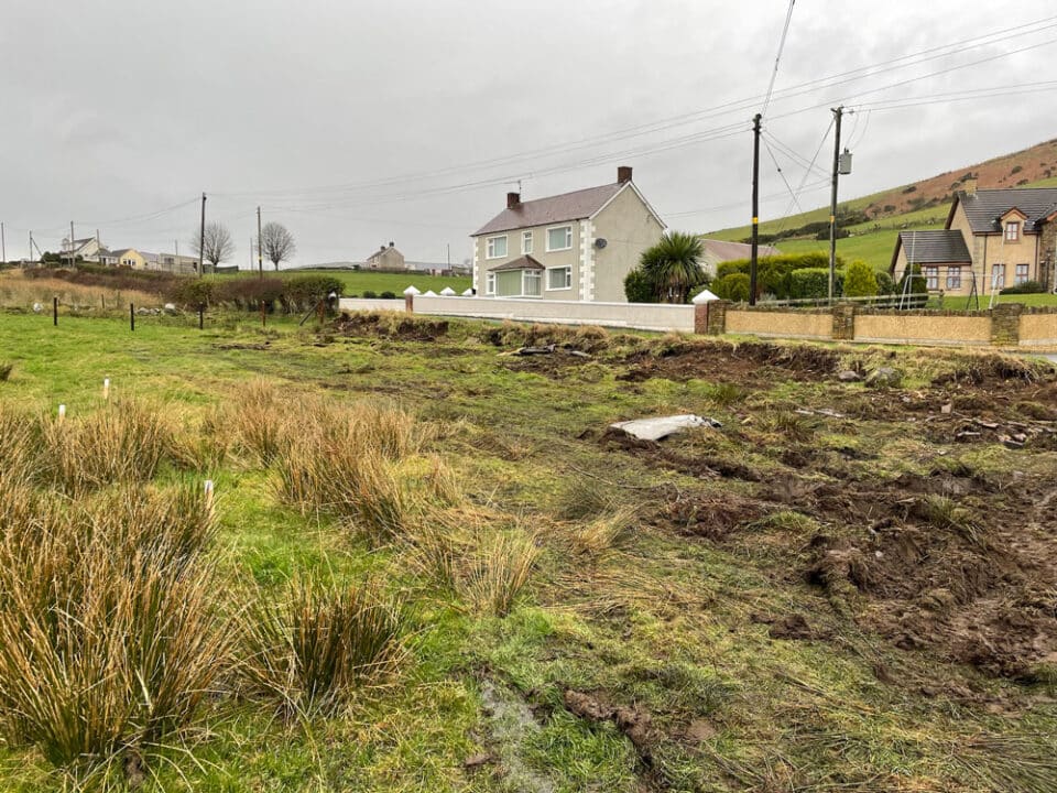
The house they bought was poorly laid out and finished to a mediocre standard, which led them to consider knocking it down and building new. “However we weren’t sure we would get planning permission and it seemed it would probably be more expensive than a renovation,” adds Máirín.
The renovation started in 2004, six years after the purchase and the year in which their eldest got married. “We moved everything into the studio while the build was taking place; it took a year as the windows caused us some delays. An elderly couple lived in the house before us and it had a cottagey look we didn’t want to keep.”
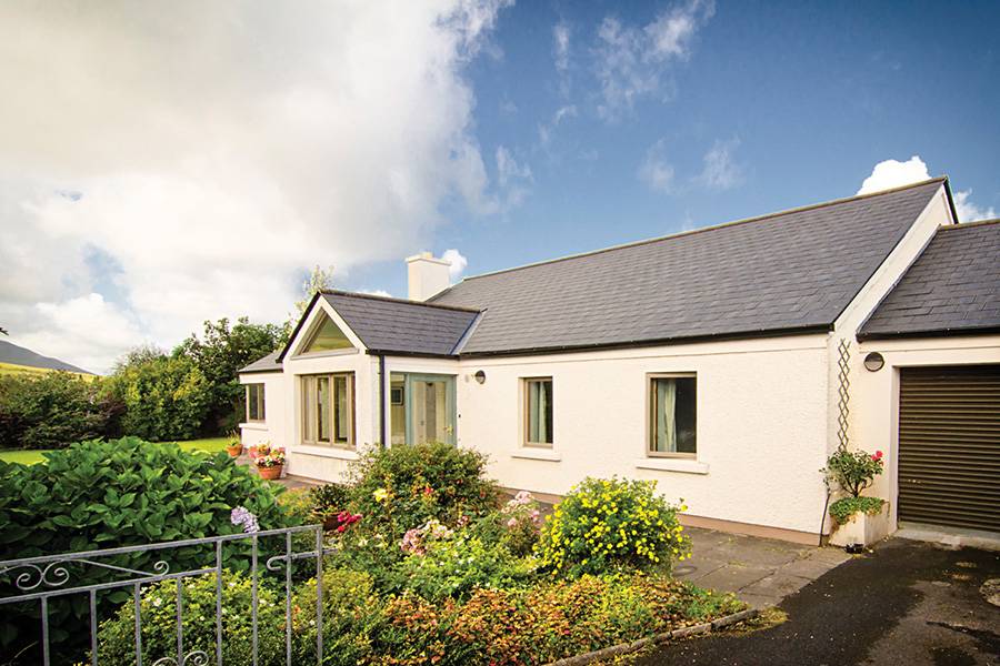
Máirín and Kevin told their architect what their priorities were, stressing the importance of the house fitting in with the surrounding landscape and not being a statement. Light was of course also high on their list. “The existing bungalow was very dark, especially the hall which, although very wide at the entrance, had no light getting in where the three bedrooms were,” says Máirín.
 “There were two porches, back and front; leaking and getting worse with each passing year. Despite this we often sat in the front porch because of the light and views so we wanted something similar in the new house.” The only other room that afforded views was the dining room.
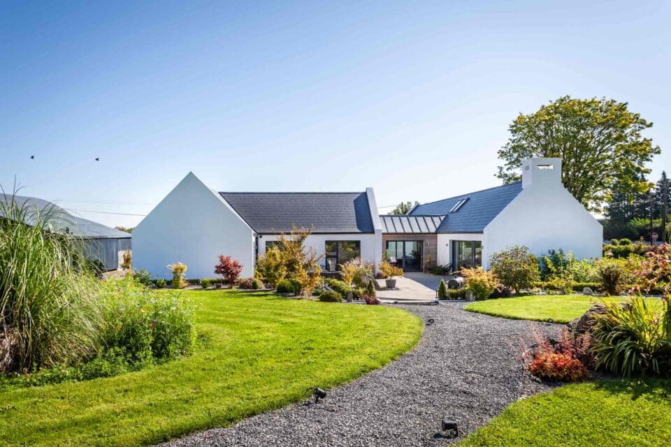
“The bungalow faces south and there is a sun-trap outside what was the sitting room but the existing house didn’t take advantage of this at all. We wanted a patio there with French windows. As well as being a sort of sun-room it acts as a barrier to the wind.”
The existing windows were teak but had been painted black and featured diamond panes. “They were ugly, warped and let in a lot of cold air! This area can be very windy and we wanted to cut down on the sound of it howling outside so we asked for the windows to be replaced with double glazing – not uPVC but something more aesthetically pleasing.” They eventually chose timber externally clad with aluminium (alu-clad).
A reconfiguration was also on the cards as the design clearly didn’t work for the couple. “We wanted a new living space. The old sitting room was quite small and draughty. We also needed a proper kitchen and bathroom, both of them were completely sub-standard. The old washing machine and drier were in the garage and adding to the wish list, a dedicated utility room to put them in.”
The garage wasn’t altered but thanks to the machines moving out, they were able to store more in it, everything from canoes to summer tables and chairs to hurleys and toys.
Other additions included an en-suite bathroom for the main bedroom and making the house wheelchair accessible, including providing a disabled access shower for their son who is a wheelchair user. All of the floors were uneven so they asked for those to be replaced as well.
Solution
The three bedrooms were unchanged but the old dining room became the kitchen, the sitting room is now the dining room, the new utility was the old kitchen and a study was created upstairs in what was the attic. Rot was found above the front wall of the old sitting room, where the new French doors were added; a steel beam was used for structural support.
“The bedroom windows and some of those at the rear reflect the vernacular style and are smaller than the ones they replaced.” The gable wall was taken out to accommodate the new living room, creating an extension to the side of the house with a distinctly modern feel. “There is a big picture window in the sitting room which frames the mountain nearby; the window seat and corner windows have proved a favourite chill-out space for us and visitors.”
The kitchen was barely 8ft/2.4m high so they opted for a double height ceiling in the adjoining dining area and hall to bring in light from the study in the attic, which is open plan. “There is a great view from the large upstairs window looking out to the mountains and the bay,” says Máirín. The double height ceiling that was added near the bedrooms is lit by two skylights.
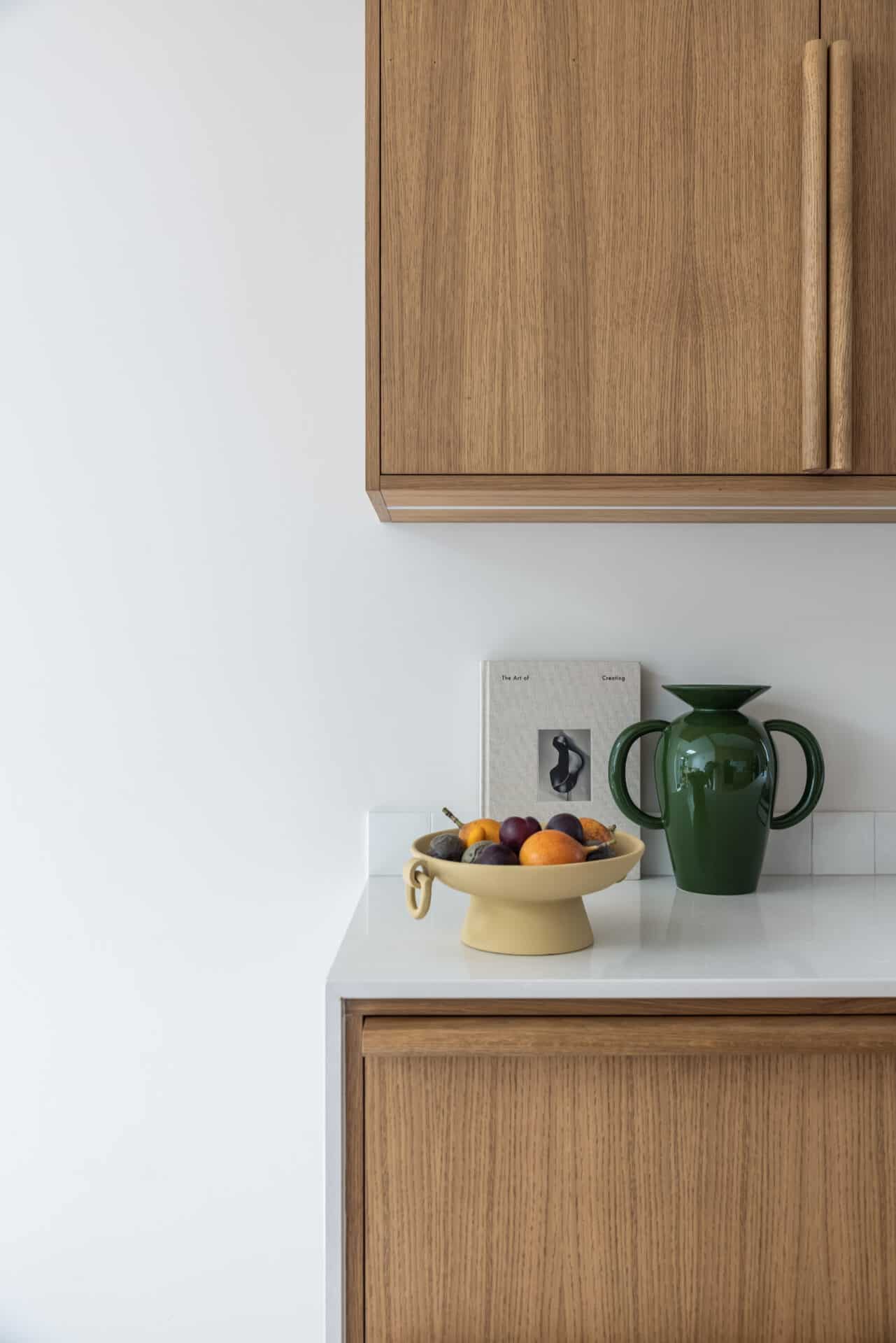
The old kitchen consisted of a bar with a range of cupboards hanging over it and was replaced with a more practical galley style. “We chose an oak finish and although shiny surfaced cream kitchens had just started to come back into fashion, we liked the warmth of the wood. The honey-coloured tiles reflect this too,” says Máirín. “I still like it even though we didn’t go for the slate flooring our architect suggested.”
 As for the services, a new hot water cylinder was added but they didn’t change the boiler. “We originally thought we would keep an open fire for the sitting room but in the end we chose a log-effect gas fire. This was because the chimney never worked properly, it didn’t have a good draught and had a tendency to smoke so we’re very pleased with this option. It is quick and clean and cosy in winter – the heat that comes off it is instant and there is no need to light a fire with bits of wood or deal with ash and the general clean up required with coal and briquettes.”
“We also like the look of the gas stove, with its log effect and modern clean lines.” A balanced flue runs up the chimney, which means no more howling wind.
As for wastewater, the septic tank was replaced by a tiered treatment system. “Water quality is a problem in the area and we dealt with that about two years ago by putting in a treatment system. We had originally hoped to eventually be joined to the public scheme but this is unlikely now.”
“With the new septic tank regulations we found it hard to find someone to service our tank for a reasonable fee but after some searching we eventually did.”
Budget driven
Máirín and Kevin were building at the beginning of the boom years. “We didn’t have an unlimited budget so we prioritised getting the basic structure right, including the windows, roof and walls. The most expensive item was the glazing.”
Their architect managed the project alongside the builder. “We were lucky in our builder,” says Máirín. “He is a master-plasterer and the finish on the walls and the vaulted ceiling in the new sitting room are beautiful. He is very meticulous and he chased the other tradesmen where necessary.”
“Our architect always kept an eye on the cost, she was great at giving us options and the costs associated with each. Thanks to this we were able to come in under budget, about 10 per cent less than anticipated, at a time when most people were overspending. We also listened to her ideas, she had to deal with all of the technical issues and her input was invaluable. She was very practical thinking about every detail, such as the door handles and she was very good with colour which we worked on together.”
“We like the clean lines, the lack of clutter, and have maintained them. As we are not there all the year round, that is relatively easy to do,” she adds. “The colour scheme is mostly cream but with a red feature wall on the chimney breast, on one wall in the dining area and one wall in the hall. This was our architect’s idea and it works really well. The bedrooms and the ensuite bathroom are light blue. The main bathroom which faces north, is peach. This is the only colour I would change.”
A key factor in keeping costs down was never straying far from the plan. “My understanding is if you start changing things around midway through construction, costs can spiral out of control so we only introduced very few changes, none of which had any significant impact on the budget.”
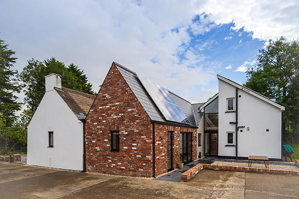
The roof was entirely replaced with fibre cement slates because the natural slate option was prohibitive. “If we’d had loads of money we would have used Bangor blue slates. We probably would have renewed the internal doors as well, instead of keeping the existing ones, but apart from that there’s nothing I would change.”
The shower area in the utility room could have been made bigger too. Indeed, due to the installation of a washing machine in the utility, the door couldn’t swing in to the shower area to allow for a wheelchair to turn around, even though it was devised to be. “But as it turns out my son doesn’t come down to Mayo very often.”
 Enlisting the help of friends and family also helped to keep costs down. “The sitting room flooring was bought in a sale and was laid by my niece’s then boyfriend,” adds Máirín. “My brothers-in-law and brothers did the tiling over a weekend, we bought them in various outlets in Kildare and Dublin.” A friend of theirs who stayed in the house a few times made the window seat and scatter cushions, picking up on the red theme of the chimney breast.
The studio
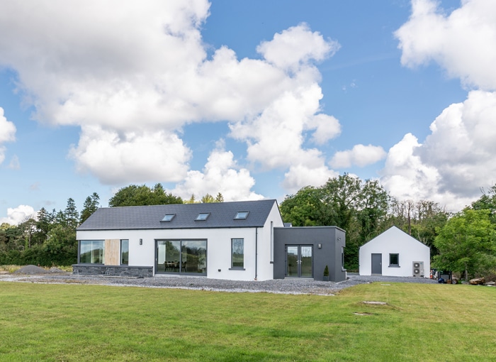
The studio consists of a single storey built by the previous owners in the back garden. It had a combined kitchen/ living area and a partitioned off bedroom with a bathroom. There was no insulation and no heating.
“The ceiling in the living area was high but there was very little light coming in and it was dark and cold. We could only use it for storage,” says Máirín. “Three years ago, during the bad winter, the pipes froze and there were several leaks. We had to make a decision to do something about it. The teak windows, again painted black, were warped and not closing properly.”
“Our budget for this was very tight and we realised it was a tall order to carry out a complete upgrade. We had no hesitation bringing back the same team that had worked on the house and they really delivered, transforming it from a horrible damp place into a lovely light-filled studio.”
“We kept the old roof tiles for reasons of cost but plan to eventually match them to the main house.” The walls had been simply clad with dark wood effect ‘beauty board’ which was removed and replaced with a plaster finish. Insulation was also added as there was none to begin with.
“The main living area is now a studio which Kevin uses for painting; the two large skylight windows give great light. We replaced the kitchen fittings with cream coloured units but kept the same configuration against the back wall.” The existing ceramic hob and sink had hardly been used and were therefore retained. “We also kept the old fridge but put cream panels on it to blend in.”
“On our architect’s advice we installed a bottled gas-fired heater, designed like a wood-burning stove, which relies on the same principle as the one we have in the main house.” The radiators are electric and the water is also heated by electricity with what’s called an electric geyser, which is located beneath the sink. These choices were made in order to get instant heat and hot water.
The studio/kitchen area is divided from the entrance with glazed panels and white painted wooden boards. “This looks really well, it gives it a seaside feel and also keeps the studio space warm. The outer area has shelves to house art materials.” The new floor is wood laminate and runs through the studio to the bedroom.
“We removed the bath and put in a new shower unit, but kept the old bathroom fittings. We may replace them at a future date. We also kept the bathroom tiles but my brother-in-law did a nice job fitting in some feature tiles in the shower area to blend in with the old. He also did a tile splash-back in the kitchen area”.
The same painter who did the main house painted the studio. Again the main colour is cream with white wood, ceiling and beams. The feature wall in the bedroom is taupe.
There was some external work that had to be done around the back of the studio on drains and moving vegetation away from the house. The garden scheme, for its part, hasn’t changed much since they bought the house. “The grass was re-seeded at the end of the build and the Liscannor flagstones which were there when we bought the house were re-laid. There is also a surrounding border of pebbles. This is good for pot plants, which drain well on the stones.”
Final thoughts
“Ten years later we still love this house. When the children visit they always fight to see who will get to stay in the studio! It’s very restful, and the garden is wonderful, our grandchildren love it – it’s an escape from their city life in London.”
Since they completed the works they’ve added an oak larder/press to hang coats and store the vacuum cleaner and some kitchen items; it’s located between the kitchen and utility. “ was always on the cards but since we’re not there all the time there was no real pressure to get it done.”
Mairín highlights how lucky they were with their architect and builder. “Many people bypass the architect, but we think this is foolish. She was essential for her technical expertise, her aesthetic sense and her ability to bring the project to completion under budget.”

