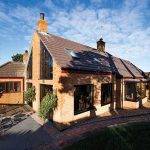
When Nick and Kate O’Neill bought an Irish fisherman’s cottage on the Co Wicklow seaside, they knew they had to take their time finding the right design team to turn it into a home they could retire to.
The first architect Nick and Kate consulted suggested they retain the traditional two-room layout, and, whilst they liked the idea of a sensitive renovation project they couldn’t see how it would meet their needs. The second architect suggested a complete overhaul, considerably extending the cottage and adding a large amount of glazing, which they felt was going a step too far. The solution, as is so often the case, lay somewhere in between. It was third-time lucky when they found an experienced local Chartered architectural technologist practice, specialised in renovation and extensions to dwellings, that found ways to change the house’s configuration all the while retaining the cottage feel.
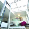
“We spent two and half years looking for the right architectural practice,” says Kate, “and by the time we did we had a very good idea of what we wanted. The wish list for the house included it being eco-friendly, low maintenance, well insulated, and we also favoured underfloor heating with wooden floors. Due to us having a small unusable shaded back yard we dreamed of having a space we could enjoy and we were delighted when our architects suggested the idea of an upside down house, with living and kitchen facilities upstairs and an integrated glass box linking into a large roof garden to make the most of the sunlight.”
The couple originally intended to keep the cottage, but due to the practical need for more space and a more flexible layout, only the two gables were retained. “Adding a second storey would have been a problem with the existing structure, due to the existing cottage having walls of stone filled with compacted earth and seashells from the beach,” says Nick. “There were engineering difficulties to overcome in getting additional ground floor room height, which required rock breaking equipment, whilst having to tie the old stone walls at the top with a concrete ring beam.” Because the site was land-locked the builder found it necessary to form a one metre passageway through the middle of the cottage, to allow for machinery to access the back of the house.
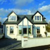
“The cottage is charming and the history of it really appealed to us,” says Kate. “So we kept the traditional frontage, and the hall door with the window on each side.” When you enter from the newly built front porch, Nick and Kate’s individual offices are off the main entrance reception. Then you step into the privacy of their home, which opens up into a modern area defined by clean lines and light. “The gable wall faces south, and the back of the home west, which means we get sunlight from 11am onwards,” adds Kate.
Irish fisherman’s cottage
The planning process took about a year, which was due to third party complaints. “We had to go back three times to get approval,” says Kate. “One of our neighbours didn’t want us to change anything. Unfortunately we couldn’t comply with his wishes, so he kept objecting until we went to the appeals board, An Bord Pleanála.”
The roof garden overlooking their neighbour’s house was the main issue, even though Nick and Kate’s view was purposely blocked by opaque glass screening. (Ironically, the necessity for a roof garden actually came about from their other next-door neighbour building a second storey right after Nick and Kate bought the house, which added to the shading of their original back yard area.)
This turn of events was all the more unfortunate as the O’Neills always wanted to foster a good relationship with their neighbours, which is why they went to each of them to present the project at the very early stages. Thankfully, all of these efforts bore fruit as everyone showed up at the house warming party!
As part of their approach to the build, Nick and Kate also wanted to use local suppliers, and the builder they chose happened to have a connection with one of their neighbours! “We got along well and he was reasonably priced,” says Nick.
Still, waiting a year for planning permission could have tried their patience, but that’s not how the O’Neills see it. “We were still living in the old house so there was no rush to move,” says Nick. “And the delay suited us to a certain extent. It gave us the opportunity to fine tune the design.”
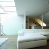
“The design got better and better!,” adds Kate. “It allowed us to change the location of the stairs four times. This all happened thanks to our architects’ patience and their willingness to do anything.” They ultimately chose to position the staircase so that when you ascend, views of the roof garden unfold.
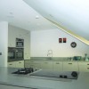
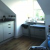
However, this meant they had to reconfigure the kitchen. “The ceiling now sloped over the hob and there was no room for an extractor,” says Kate. “Airtightness of the building was critical due to having a mechanical heat recovery ventilation system installed, so instead of putting in a hole in the roof we chose a pop up charcoal filter extractor hood that rises from the countertop electrically.”
The kitchen was designed around the way Kate cooks. “It’s a good layout for several to work in at the same time,” she says. “At Christmas we had 15 people on the day and four of us worked around the kitchen very easily thanks to the independent spaces.”
The architects’ input went beyond the design, as they oversaw the tender process and build, ensuring the house was being constructed and specified in accordance with their drawings.
Perhaps even more importantly, they strongly encouraged Nick and Kate to employ a quantity surveyor, and they’re thankful to have followed that advice. “We quickly realised how important his role was, overseeing all financial aspects of the project on our behalf,” says Kate. “It looks like you’re paying a few thousand euro for nothing but it saved us the cost of stress management courses! He did all the negotiations, we never worried. We didn’t get the bills from the builders, everything went through him and he made sure it was all in and checked it. We just signed off on things and paid within the month. I’d advise anybody to employ one!”
Low maintenance
The low maintenance and convenience elements of the design were key, and so the O’Neills went for a central vacuuming system. “We’d recommend it without doubt, especially in the kitchen,” says Nick. “We decided we’d give up bending down, so the tube plugs into the kitchen board.”
The countertop is another example of the low maintenance mantra. “We originally wanted marble but decided against it, primarily because it stains,” adds Nick. “Instead we chose a material formed of natural quartz.”
“It’s medium grey in colour with a silica flex and a matt texture. It took us a long time shopping for it but it was well worth it,” says Kate. “We can cut, chop, abuse it as much as we want, put hot pots on it, it doesn’t stain and there’s no scratching.”
The O’Neills had to buy the whole sheet and cut out the countertop from it. “It just about fitted up the stairs!,” says Nick. From the leftovers the architects suggested they build two tables with fixed bench seating nestled within the front dormer spaces.
The flooring was also a low maintenance solution; a smoked oak floor with a green tinge was used throughout the house, which is easy and quick to mop. “I’d recommend a timber floor with underfloor heating,” adds Kate. “It looks great and works really well.”
The low maintenance precept extends to the type of heating they chose, as the couple wanted to retain a constant temperature in the home without having to adjust boiler time schedules and settings. And since they were about to retire, they didn’t want ongoing expenses.
The solution in their airtight home was a combination of mechanical heat recovery ventilation to give a fresh internal air environment and for the heating appliance an air to water heat pump, which works at temperatures of down to minus 20°C outside. The heating is on all the time, but at a very low temperature. The hot water is also supplied by the heat pump, backed up by an immersion tank in the event of the outside temperature dropping below 0°C. The electricity bill, which covers all of their energy needs, including heating and cooking, is unfortunately a bit higher than they had hoped. “A rough estimate comes in at less than €2,000 a year,” says Kate. “We thought it would be lower than that but electricity is our only utility bill.”
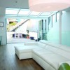
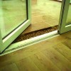
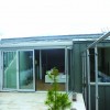
 Nick and Kate wanted the living space to be level with the roof garden, only interrupted by the folding sliding door system. “To the credit of our architects they provided a special detail of a trough filled with pebbles which prevents water or dampness entering the house,” says Kate. “When our living space full-width folding sliding doors are open to the roof garden, the room feels like it’s twice the size! Due to the huge amount of glass the room is not as warm as we expected, but there are no obvious draughts. In the summertime the back doors stay open, it gets too hot if they are closed, but it’s nice because we have a view of the sea.”
Lights… action!
Nick is a cameraman, and his professional input comes to the fore when he talks about lighting. “We chose LEDs with a 3,200K temperature because we didn’t want a cool colour but rather a warm light,” he says. Warm light is the orangish colour we’re used to get from our household lamps, it typically corresponds to a range of about 2,700K to 3,000K. Above 4,000K the light starts to become “colder”, giving off a brighter light; above 5,000K you’re looking at the bluish light similar to what you’d get in an office. “We put in cool lighting in the bathrooms for a daylight feel,” adds Nick.
As could be expected, the O’Neills built a media room, the design of which evolved quite by accident. “During the build we would visit the site almost every day, we used to live down the road,” says Kate. “We checked for anything that might need to be changed or investigated. For instance we had a lot of questions about the plumbing and underfloor heating, which were clarified.”
Even though the design had provided for high ceilings the decision to proceed with ample headroom only came about during the construction stage as it depended on how much of a void was under the ground floor and how much rock would need to be excavated. “Once construction started and the site was cleared it gave the quantity surveyor a better understanding of how much it would cost to do,” says Nick. “Fortunately there was not as much rock as thought so we were able to proceed with the architectural specification of 2.65m head height.”
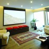
The architects then suggested a suspended drop ceiling, 2.4m in height, in the media room with perimeter LED lighting system, speakers and a cinema projector. “This new ceiling is now at the same height as the old cottage and provides continuity,” says Kate. “And it allowed us to camouflage the electrically operated cinema screen into the wall recess,” adds Nick.
Unsurprisingly, the lighting in the media room was given a lot of thought. “The strips of LEDs give a soft atmospheric lighting when watching a movie,” says Nick. “The internal courtyard then provides natural light to the media room, as well as to the master bedroom.” The media room has access to the courtyard where Kate keeps her plants.
The ‘Comms room’ is under the staircase, the control centre for the home automation system. “We’re connected to the internet so we have radio stations from all over the world as well as the usual cable TV, DVD, and so on. The controls for the heating system are also under the stairs. There’s nothing in the media room except the speakers.” Surround sound of course!
Each room has its own media centre, so you can listen to different radio programmes, but there is a party mode option as well which allows you to have the same music throughout the house. Outside, the gadgetry gets even more impressive – there’s a fake rock that hides the speakers! As for the outdoor lighting, the fixtures are recessed and the lights are in the plant box area.
Back indoors, even the staircase was carefully lit, with every second step illuminated from the side wall, making for safe nighttime climbing. In the utility room, meanwhile, they used a light tube. “There are no windows, but you don’t notice it,” says Nick. “We walk in and out without switching on lights. We actually first saw this S-bend light tube design in France.”
The choice of lighting for Nick and Kate was linked to the colours on the walls, to create shadows and pockets of light. “There is no white paint in the house, it’s all off white with just tonal differences between the walls,” says Kate. They all look the same but each tone plays a role in providing interest. “When we went to do touch ups I had to use my photo lamp to see exactly what colour was used!,” adds Nick. That’s how slight the differences are.
The devil is in the detail
In fact the choice of colours was the brainchild of their interior designer. “As a gift from a relative we got an interior designer on board,” says Kate. “He helped design the layout of the main living/dining space with the feature contemporary fireplace. Between the media room and Nick’s office he also created a wall with open slots giving connection.”
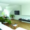
The contemporary fireplace was carved into the blank living room wall, and is fueled by bio ethanol, yielding heat equivalent to a 2kW electric fire. “The interior designer thought it best to use this fireplace feature to break up the continuity of the long blank wall,” says Nick. “This allowed for a small concealed bookcase to be inserted into the side of the fireplace.”
“There’s a shadow reflected above fireplace, which completes the effect,” adds Kate. “Because the home is airtight the fire heats up the room in an hour and it can get too warm, although there are metal pieces we can insert to reduce the height of the flame.”
There are some more subtle design details in the home, including small things like sunken electrical sockets in the dining area. The staircase also provides some welcome surprises. “The hand rail doesn’t get in the way, it’s recessed into the wall creating a shadow gap that complements the other detailing,” say Nick. “The stainless steel rail was designed to sweep vertical for about four inches and link into frameless butt jointed glass that surrounds the stairwell.”
Even the furniture was chosen for the way it would frame the views as you walk up the stairs. “You can see across the floor thanks to the sofas and table being an inch off the ground,” says Kate.
“And the plasterers were amazing, they had four angles to work with from floor to ceiling! The job was made all the more challenging as we didn’t want skirting boards,” says Nick. “They weren’t thrilled because that meant they had no margin of error. The architects came up with the design solution, what they called a ‘shadow gap detail’. U-shaped metal profiles were inserted to separate the walling from the timber painted skirting boards and architraves, this gave the impression that the walls continued straight down into the floor uninterrupted. Everybody was happy with the solution, especially us. We’re delighted with it.”
Outdoors, the practicalities of what to do with the services were given careful consideration. “The air to water heat pump is on the patio, hidden by the glass wall. In order to reduce noise, it was raised above the ground and placed on springs – you can put your hand on it and shake it!,” says Nick. “It basically eliminated the low drone you would normally get. But it’s important to do that at the beginning for piping.”
As for the floor covering outdoors, at the start the O’Neills envisaged an all granite surface but they took on the advice of their architectural team and interior designer. “To avoid the bland look of all stone on the roof garden we added a decked area made of timber composite, which was set level with the granite. The decking’s L-shaped seating with built-in lighting is made of the same material, as was the bench. We are really happy with the decking as it acts as a drain, and won’t rot or mould,” says Kate.
All of this of course, comes at a cost, but Nick and Kate have no regrets. “The project was estimated at €350,000 but we made a number of changes,” says Nick. “What wasn’t included in the price was the roof garden design and sheltering, the glass cost about €10,000 and the fireplace a few thousand euros. The labour on the stone for the roof garden and bathrooms was also an added expense, but well worth it. It’s a mistake sometimes to stick to your budget, you end up compromising. Then sitting in your home you start thinking, ‘we could have afforded that’.”
The only regret the couple have is perhaps the small size of the site, even though the most was made of what was there. “There’s not a huge amount of outdoor space,” says Kate, “and I wanted a shed to do some sculpture but the site didn’t allow for that. A basement would have been nice too but it wasn’t possible.” You can’t have everything, but they certainly came close.
House size before: 98 m2
House size after: 179 m2
Total cost: €400,000
BER: B1
Air Tightness: 4.8 M³/(h.M²)@50 Pa.
Construction spec: Existing fisherman’s cottage with new pitched roof including dormers 0.19W/m2K; rear first floor flat roof garden, warm roof tapered insulation system and internal composite dry lining 0.16W/m2K; new rear ground floor extension walling (215mm solid blockwork) with internal composite dry lining 0.24W/m2K; existing cottage with 215mm solid block, first floor and existing random stone, ground floor incorporating internally dry lined walling 0.25W/m2K; solid new ground floor with underfloor air to water heating system 0.15W/m2K
Windows: Glazed doors to roof garden: low-e, double glazed, argon filled, warm edge spacer bars, U-value 1.1W/m2K; rest of windows timber double glazed 1.25W/m2K


